Christian charity branding

IE Brand is an award-winning brand and digital agency for Charity, Health and Education. In 1994, our very first client was a Christian charity (Agapé UK) and since then, we've worked with dozens of faith-based clients. 

We help faith-based charities to engage with Christian and secular audiences alike – increasing their impact and income.

Global Christian charity rebrand
Innovista Innovista needed a new brand that would work equally well for Christian leaders, charity staff and donors. IE Brand repositioned the organisation and created a hopeful, positive brand that also reflects the grittier, more challenging side to their…
Rebranded Christian charity retail division
The Leprosy Mission Shop As the commercial trading arm for The Leprosy Mission, all profits from the Shop support the mission to end leprosy transmission by 2035. The Leprosy Mission Shop needed to make more of its connection to the parent charity and show customers how…
Christian rehabilitation charity rebrand
Langley Trust Langley Trust appointed IE Brand to support them through a rename and rebrand project. Following a period of immersion and research, we evolved their brand positioning and transformed their visual identity to reflect the exceptional organisation…
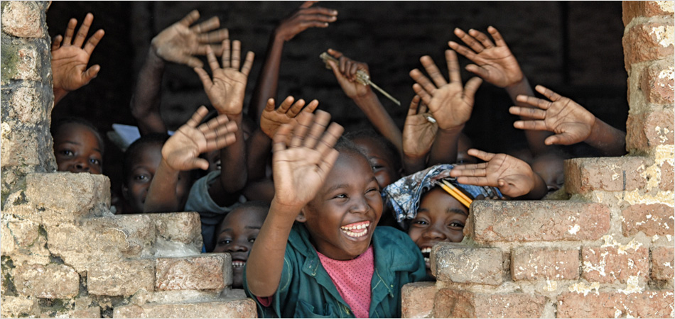
New brand and website for International charity
L'Arche International federated charity L’Arche came to IE with a storytelling challenge. They were struggling to articulate what they do, and wanted to re-energise the organisation following a recent inquiry. L’Arche (French for ‘The Ark’) is building a…
Rebrand and website for an evangelical Christian charity
Agape UK Agapé invited IE Brand to develop a distinctive new brand position based on detailed stakeholder research. We simplified the charity's brand architecture, created the Discovering Jesus Together strapline and nudged the name to…
Renaming, rebranding and new website for Christian charity
Clergy Support Trust IE Brand carried out in-depth stakeholder research, which resulted in 'Sons & Friends of the Clergy' being renamed 'Clergy Support Trust'. We then created new brand messaging, visual identity and a new logo for the Christian charity, supported…
Refreshing the brand and website for a women's centre with Christian roots
Anawim In parallel with rebranding Anawim and developing its new visual identity, IE Digital built a new WordPress website for the charity. Anawim is a charity that helps women in and around Birmingham, whether they are struggling with trauma, domestic…
Christian charity brand and visual identity
CHIPS Charity CHIPS (Christian International Peace Service) asked IE Brand to help them re-articulate their story and craft a new brand to take them forward. CHIPS joins with communities from both sides of a conflict – from Brixton to Ghana – to help…
A visual identity refresh and campaign to reach students with the good news of jesus
UCCF: The Christian Unions UCCF: The Christian Unions needed to refresh its visual identity to appeal to its core audience of Christian students, whilst preserving its 100-year-old heritage for existing supporters. Christian Unions are student-led mission teams that…
80
%
increase in website page views after the rebrand
Catholic philosophy and theology college rebrand and website
Heythrop College, University of London Before we landed As a Kensington based conservative Catholic college, fast approaching its fourth centenary, Heythrop was increasingly aware that its offering was falling out of step with student needs. Brand positioning and digital strategy –…
  • BRF logo in grey and white
    BRF logo

    IE has delivered a number of digital projects for BRF Ministries. 

    We migrated one website from Drupal to Wordpress and combined it into a multi-network website with BRF to bring a consistent approach to all of their sites. Then we revamped the BRF website with a new look and feel. This used their existing visual identity, but incorporated some brand tweaks in response to research. Next we designed and developed a new website for Messy Church – the first to roll out across the wider BRF network. 

    Behind the scenes we've also been moving their shop from Shopify to WordPress, improving various systems, and more. 

    The new BRF website is fantastic and it looks so good. The navigation and design have just taken what we do to another level. Please can you convey our thanks to the team. Not only have we got a fabulous new website but the working together has been constructive and we have delivered the website to the deadline.

    Karen Laister
    Head of Marketing, Communications and Strategic Relationships
    Close Get in touch Get in touch Get in touch
  • Christian Aid logo (grey)
    Christian Aid logo

    Children smiling and waving

    Prior to investing a significant sum in a national campaign to raise brand awareness in the UK and Ireland, Christian Aid commissioned IE to undertake a brand audit and a top-level response to the proposed campaign strategy. 

    The work was effectively a high level 'sense check' in order to ensure that this household name, £100m+ charity was as well prepared as possible to optimise the impact of an omni channel, above and below the line marketing campaign to drive up awareness of the critically important work of the charity.

    IE delivered a succinct and astute evaluation of the challenges facing our brand. They clearly have a passion for their work, combined with a really helpful mix of charity and wider market knowledge.

    Claire Aston
    Head of Strategic Communications, Christian Aid
    Close Get in touch Get in touch Get in touch
  • The Church of England logo (grey)
    The Church of England logo

    Church of England member of the clergy

    The Church of England plays a vital role in the life of the nation, proclaiming the Christian gospel in words and actions. Its network of parishes cover the country, strengthening community life in numerous urban, suburban and rural settings. 

    The Church's Vocations Team approached IE Brand to commission a resource to help people to consider their calling – with the specific goal of widening diversity: encouraging more young people; more women; and more black, Asian and minority ethnic people to consider entering the ministry. 

    The result was an understated, typographically classical brochure covering everything from priesthood to monasticism, character attributes to the application process. Text was interspersed with stereotype-challenging photographs including a young Asian woman Vicar in a skate park, a pastiche of Michelangelo's The Last Supper with a diverse group of theological students studying at a long table, a black priest administering communion in the historic environ of Southwark Cathedral and the Archbishop of Canterbury washing feet at a festival.

  • Betel UK logo (grey)
    Betel UK logo

    Betel charity branding by IE Brand

    Betel UK is an independent Christian charity for people affected by drug and alcohol addiction. They thrive by training their residents to be furniture restorers, tree surgeons and landscape gardeners. This funds their work, and many residents go on to run the businesses and mentor others.

    IE Brand carried out consultancy to clarify Betel’s proposition, focus its marketing messages and map its seven audiences, and redefined their messaging, proposition and tone of voice. This led to the creation of a fresh new visual identity that brings Betel’s work to life, emphasising the real people and success stories behind the organisation.

    IE created new brand guidelines with variants for the five different Betel companies and designed and built a fully responsive new website. We also built a new ecommerce site for the "Restored by Betel" furniture business, and carried out a full review of Betel's pay-per-click advertising, unearthing a potential £50k improvement per year in PPC effectiveness. 

    Read more about our charity rebrand for Betel UK

    An excellent personalised, customer centred service. We love the new brand and website. Thanks so much for all your hard work!

    Chris Servante
    Online Retail Manager, Betel UK
    Close Get in touch Get in touch Get in touch
  • Open Doors International logo (grey)
    Open Doors International logo

    Open Doors magazine

    Open Doors International (ODI) serves persecuted Christians worldwide through bible delivery, bible training, practical support, advocacy and prayer.

    IE has worked with ODI on projects as varied as a supporter magazine toolkit, a gamified interactive learning resource, a 60th anniversary logo and digital consultancy around customer journeys through ODI's suite of international websites.

    We were also commissioned to undertake a comprehensive brand audit to inform the future development of the Open Doors brand.

  • Serving in Mission logo (grey) by IE Brand
    Serving in Mission logo by IE Brand

    Serving in Mission brand

    As the UK branch of SIM, Serving in Mission is an international, interdenominational Christian mission agency with more than 1,600 missionaries serving in over 60 countries.

    Initially founded 100 years ago as the Sudan Interior Mission, SIM UK – as it had become known – was struggling to meaningfully engage with a younger and increasingly digital-savvy world, and brand recognition was poor. 

    IE Brand carried out a market positioning/competitor analysis exercise to help SIM UK work through the pros and cons of a renaming and rebranding exercise. Following stakeholder research and positioning analysis, IE renamed, rebranded and repositioned SIM as Serving in Mission. We developed a new multi-channel digital strategy focused on exposing stories of transformation with on and off line calls to action around “Go,” “Pray,” and “Give”.

    Read more about the Serving In Mission rebrand and website

    I have very much enjoyed working with the IE Brand team and particularly appreciated your help and support through the challenges of the project.

    Allie Schwaar
    Communications Manager, Serving in Mission
    Close Get in touch Get in touch Get in touch
  • Heythrop College University of London logo/crest in grey
    Heythrop College University of London logo/crest

    Heythrop College brand and website by IE

    Part of the University of London, Heythrop College was established in 1612 and provides undergraduate and postgraduate degree programmes in philosophy and theology. They were re-expressing their course offerings to fit more closely with students’ needs, and wanted a new brand and website to help communicate that to potential students.

    IE Brand reviewed Heythrop’s internal research to summarise the top line brand, and agreed a vision for the college’s identity. We repositioned Heythrop from a conservative Catholic college of theology and philosophy, to a vibrant college of the University of London, thus attracting and moulding students to change their world.

    IE introduced new, intriguing images and messages to bring the personality of the college to life on and offline. We also evolved the school’s crest and modified the typography to align it more closely to that of University of London. The college's fresh new website had a stunning user experience to help students find the information they need.

    Read more about Heythrop College University of London

    IE’s brand and digital expertise has given Heythrop a new voice, a new look, a brand new website and renewed confidence.

    Amy Fenton
    Marketing Manager, Heythrop College – University of London
    Close Get in touch Get in touch Get in touch
  • Scripture Union logo (grey)
    Scripture Union logo

    Scripture Union children's magazines

    Scripture Union is a global charity working in over 140 countries. Light is SU’s market leading range of resources for children and youth, consisting of 5 kids’ and 4 leaders’ magazines, distributed throughout the English-speaking world. 

    Scripture Union wanted to re-establish themselves as market leaders, so they came to IE Brand to rename and rebrand the product range. We created brand communication guidelines for the magazines, plus new age-specific sub brands for each of the 5 children’s magazines. 

    We provided the in-house design and web teams with new templates, style guidelines and graphical assets with which to manage the identity.

    Without a doubt, IE Brand’s clean, fresh and contemporary design and web solutions have given us the best possible start in maintaining our position as market leader in our field. IE have always listened carefully to our needs and suggestions then, time after time, have far exceeded our expectations.

    Terry Clutterham
    Head of Resource Development, Scripture Union
    Close Get in touch Get in touch Get in touch