
Langley Trust
Services
Renaming
Stakeholder engagement & research
Brand positioning & messaging
Visual identity & logo design
WordPress website
Charity Marketing
Charity Web Design
Industry
Charity
Christian charities
Health charities
Mental health
Langley Trust appointed IE Brand to support them through a rename and rebrand project. Following a period of immersion and research, we evolved their brand positioning and transformed their visual identity to reflect the exceptional organisation they are.
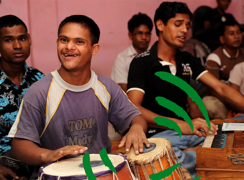
For 65 years, Langley Trust has been helping people with convictions to transform their lives. Their work to support prison-leavers prevents crime, promotes rehabilitation, and reduces the risks of re-offending. As a Christian charity working across England, they believe everyone deserves another chance.
As well as the rebrand, IE designed and developed the new website for Langley, all in time for their anniversary celebrations and relaunch.
Image
Listen
Stakeholder engagement and research
The Trustees of Langley House Trust, as it was then known, had decided the organisation needed a rebrand. They recognised that the existing visual identity was dated, and their online presence no longer reflected the size, professionalism, or values of the Trust.
At the end of 2022, they approached agencies – including IE Brand – to deliver a brand positioning exercise, rebrand the charity, and build a new website. And it was all needed in time for their 65th Anniversary celebrations in September 2023.
Having successfully pitched for the work, our brand consultants immersed themselves in Langley. We reviewed existing strategy documents, research outputs, and marketing materials to understand the organisation. Then we conducted internal workshops and interviewed external stakeholders, to compare internal perceptions with the charity’s external reputation. Gradually we formed a clear picture of Langley’s key audiences, and the brand’s personality.
Image
Image
IE have been a creative joy to work with. We had fun working together despite pretty much all of this being online. From start to end they were clear about their processes and methodology, and everything came in on time and to budget.
Rev Andy Rider, Director of Chaplaincy Services, Langley Trust
Image
Advise
Recommendations for the new Langley
Based on analysis of our research, IE prepared a short presentation to key stakeholders – from the Executive team through to the Board of Trustees. We presented our ten key recommendations, to ensure internal buy-in before beginning the creative phase.
Growing the fundraising ask
Langley is in the enviable position of receiving almost all of its funding from local and national Government bodies – specifically the Ministry of Justice. But that was also a vulnerable place to be – it’s impossible to know how stable that funding will be in the years ahead. We recommended that Langley diversify its income streams and grow its fundraising ask.
Engaging the Christian community
IE knew that Langley’s relationship to the church and Christian community could be key to attracting staff, volunteers, donations, and other forms of support. We looked at the charity’s brand positioning alongside others operating in a similar space, and particularly the huge number of Christian charities.
We created a competitor brand map, showing the key organisations in the space. We identified the characteristics of their audiences, and the top channels to reach them.
Naming and brand architecture
The charity already knew they wanted to shorten the name from Langley House Trust to Langley. In particular, the word ‘House’ tended to suggest a much narrower remit than the range of services on offer.
To truly own their name, IE recommended that the full name should be Langley Trust, to differentiate from all the other ‘Langleys’ occupying space online. The word Trust also helps to convey their charitable status in one simple syllable. Once introduced, Langley Trust can be shortened to the more informal ‘Langley’.
There was also some confusion over sub-brands. In particular, when Langley merged with Kainos 10 years earlier, they had retained the Kainos brand for in-prison services. To improve awareness and truly embrace the Langley name, we advised they retire the Kainos name and fully absorb those services under the Langley umbrella.
One brand, three propositions
Langley is now a single, unified brand, with three distinct value propositions:
- A complex care provider – offering support and accommodation for people with convictions, disabilities, mental and physical health challenges, and those who are elderly or vulnerable.
- A specialist housing association – providing accommodation for people with convictions and support towards independent living.
- An advice service – giving practical support to people in and outside of prison to help them to transform their lives.
These objectives are complementary, and revolve around Langley’s brand essence: offering everyone another chance.
With this simplified proposition, all Langley needed was a new brand to help them communicate their scale and deliver on their marketing strategy – particularly around improved recruitment comms.
Image
Image

Deliver
Messaging and visual identity development
We knew that trying to talk about everything Langley does all at once could be confusing and overwhelming for their audiences. That’s why we developed a two-stage approach for the brand messaging.
The introduction always comes first, sharing the kind of top level information that all of Langley’s services have in common. When more detail is needed, we split the offer into the three distinct propositions. Although there’s some overlap, that’s better than trying to clumsily combine it all, because someone seeking advice in prison has different needs to someone who’s just been released and is looking for a home.
All of the messaging conveys Langley’s brand personality traits: acceptance, hope and realism.
- Accepting because – inspired by Christ’s love – Langley believes that everyone deserves another chance and that nobody is beyond redemption.
- Hopeful because we believe that with support, people can transform their lives for the better and positively contribute to society.
- And realistic, because the world we live and work in is complicated, and can be hard.
The charity’s experience, expertise and resilience allows them to walk where others fear to tread.
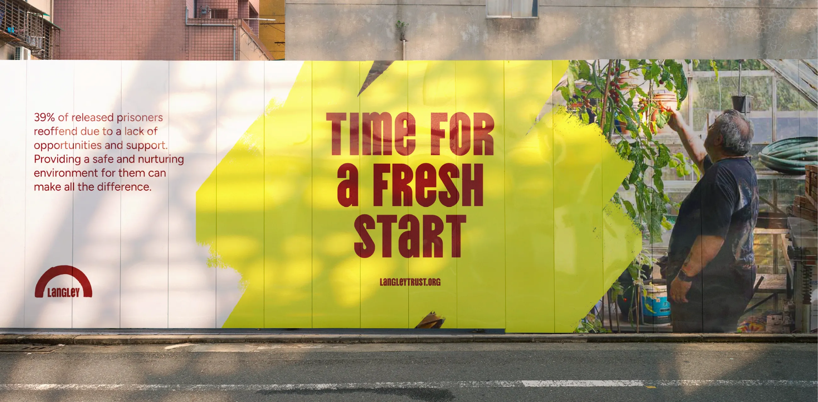
A descriptive strapline
The old strapline, 'Helping people to live crime-free lives', wasn't working. And with a shorter name, Langley’s strapline needed to work even harder to explain what they do.
Use of language around Langley’s services was always potentially sensitive, so getting it 'just right' was a challenge. There was a danger that over-censoring could result in something very bland. After careful consultation, the lead messaging became:
"We are Langley Trust. We help people with convictions to transform their lives.
Our work prevents crime, promotes rehabilitation, and reduces the risks of re-offending.
As a Christian charity working across England, we believe everyone deserves another chance."
And the primary strapline is now: Everyone deserves another chance
Defining success for the new brand
Langley were keen to change up their visual identity, to reflect a changing organisation. The new identity has been meticulously informed by conversations with staff, partners, and clients.
They needed to look and feel more like a non-profit, and less like a generic Government department. We also needed to show that Langley is anything but a small, local charity, and demonstrate the scale and scope of the organisation.
The new look needed to appeal across all the target audiences:
- Clients and their families
- Churches
- Referrers and partners (e.g. Ministry of Justice)
- Supporters (e.g. donors, prayers, volunteers)
- Local communities and MPs
- Prospective staff
A new logo for a reimagined brand
The new identity is designed to stand out from the crowd, allowing Langley to build awareness and look as good as they really are.
While they are proud of their foundations as a Christian organisation, it’s not relevant in every context – their support is for all. The brand needed to embody their Christ-like values and foster stronger relationships with the church, but avoid any overtly Christian imagery. It needed to look modern, contemporary and professional, projecting credibility, experience and expertise.
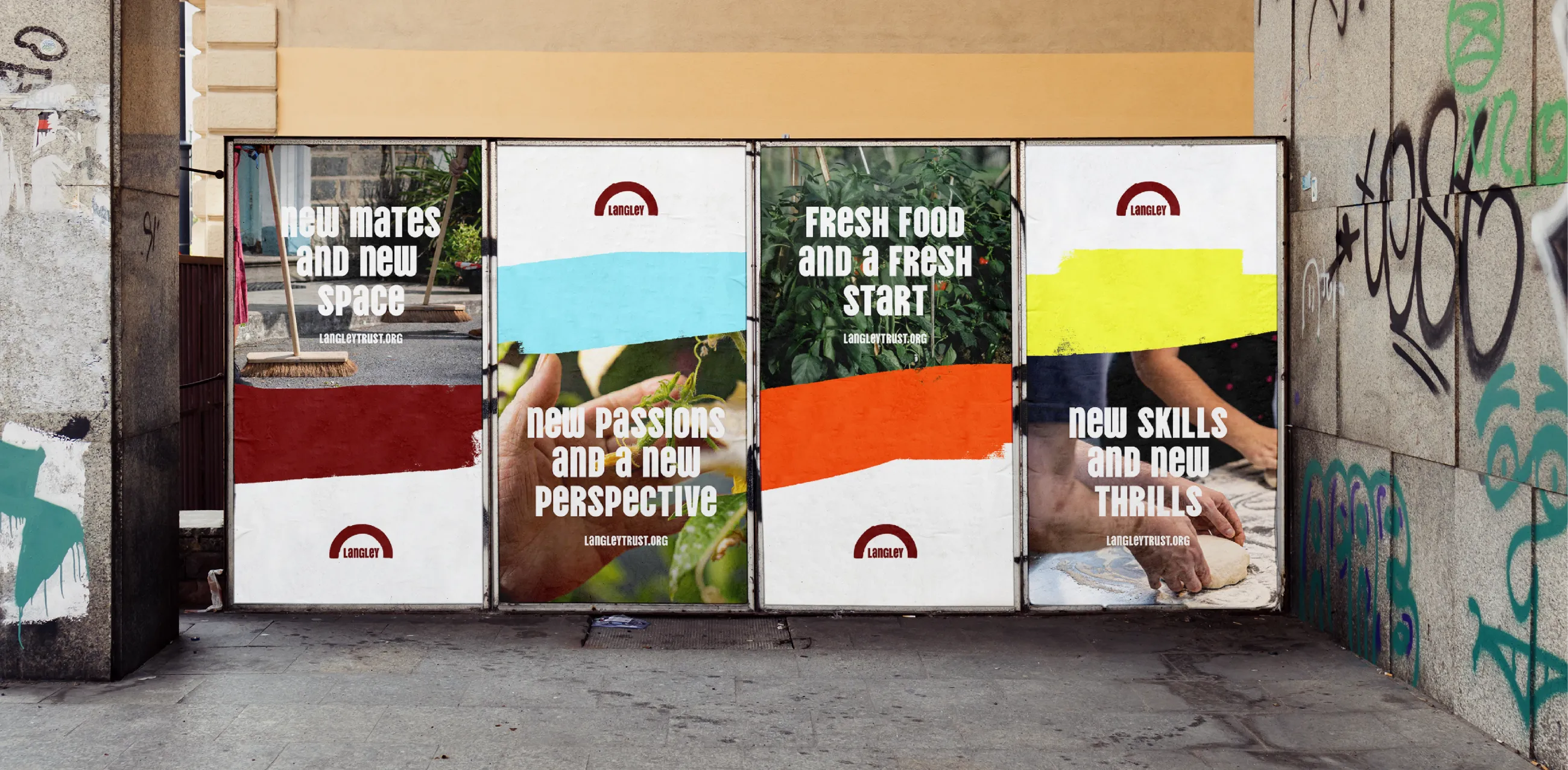
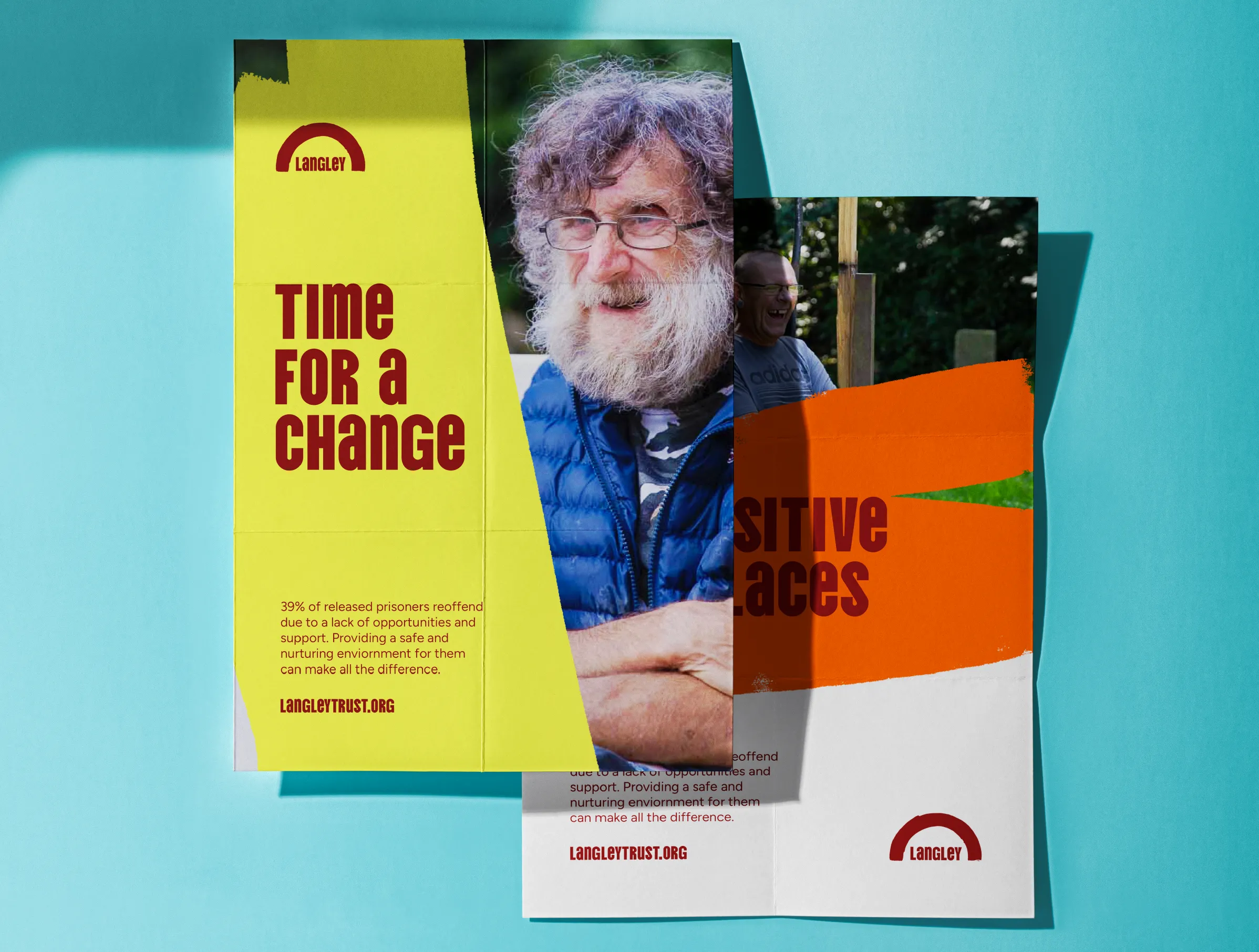
The new Langley logo features a simple arc motif. Its exact meaning is deliberately open to interpretation, but some see an arch, a doorway, a bridge, or a roof.
An inclusive visual identity
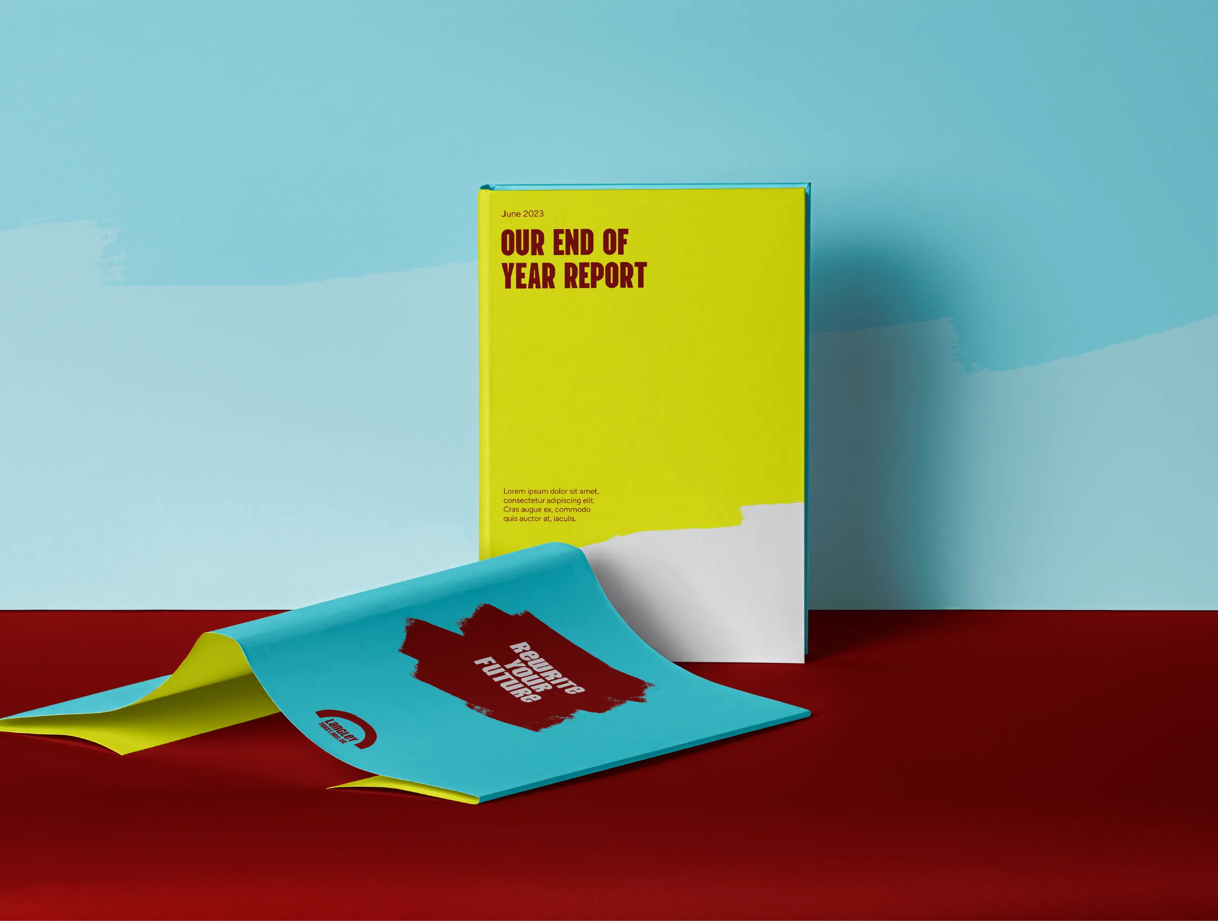
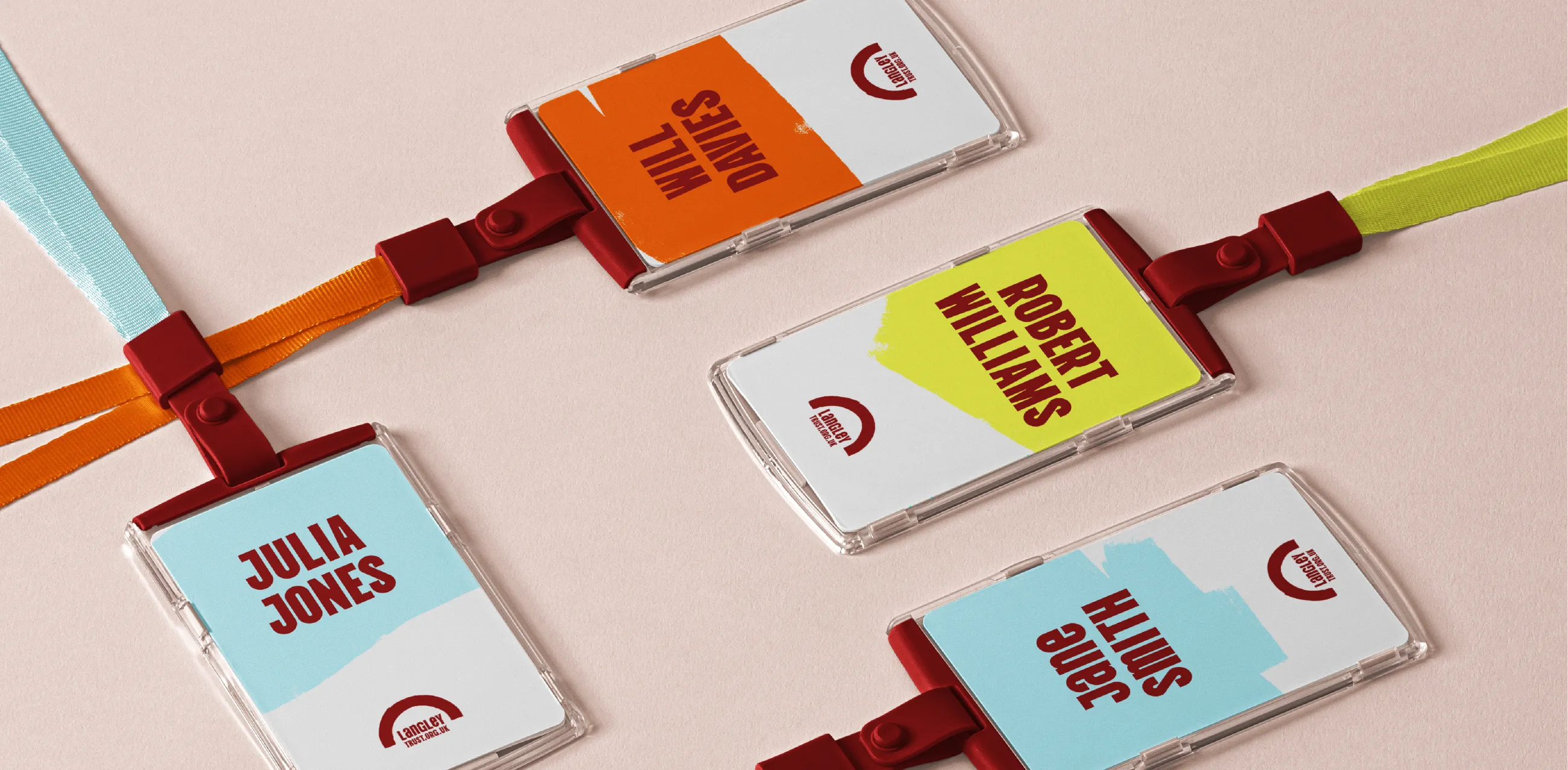
IE moved the brand’s colours away from blue, choosing a palette inspired by nature. The core colour is Earth, with three secondary colours: Brick, Sky, and Sunshine.
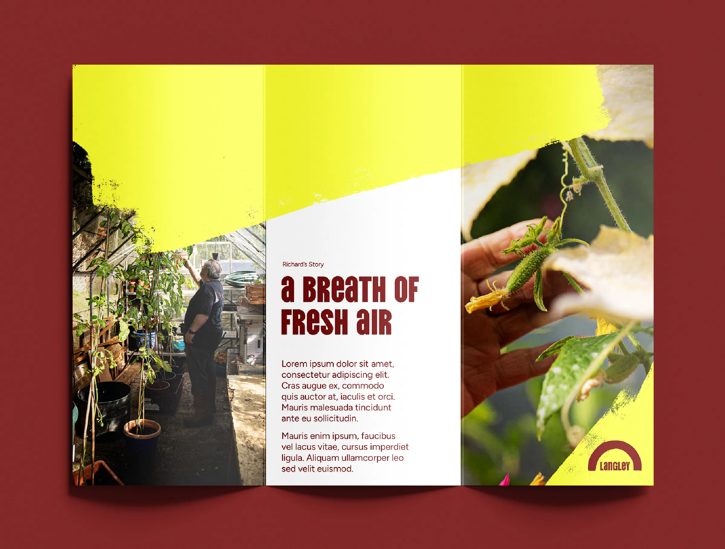
We placed empowering and authentic images of people at the heart of the brand, with the emphasis on positive outcomes. The brand represents the breadth and diversity of the audiences that Langley serves, using bespoke photography taken in real locations wherever possible.
Photography can be combined with a unique set of ‘brush strokes’ assets, typography and a bespoke set of icons, to create interesting and impactful design layouts.
Overall, the visual identity reflects Langley’s brand personality.
Launching the new brand
The new brand and website launched in September 2023 to tie in with their 65th Anniversary Thanksgiving Service at Christ Church Spitalfields in London. To support the brand's roll-out, IE Brand created a set of brand guidelines and templates including posters, flyers, welcome signage, pull-up banners, flags, brochures and other stationery. We also built Microsoft Office templates, email signatures and social media assets.
Image
Video file
Support
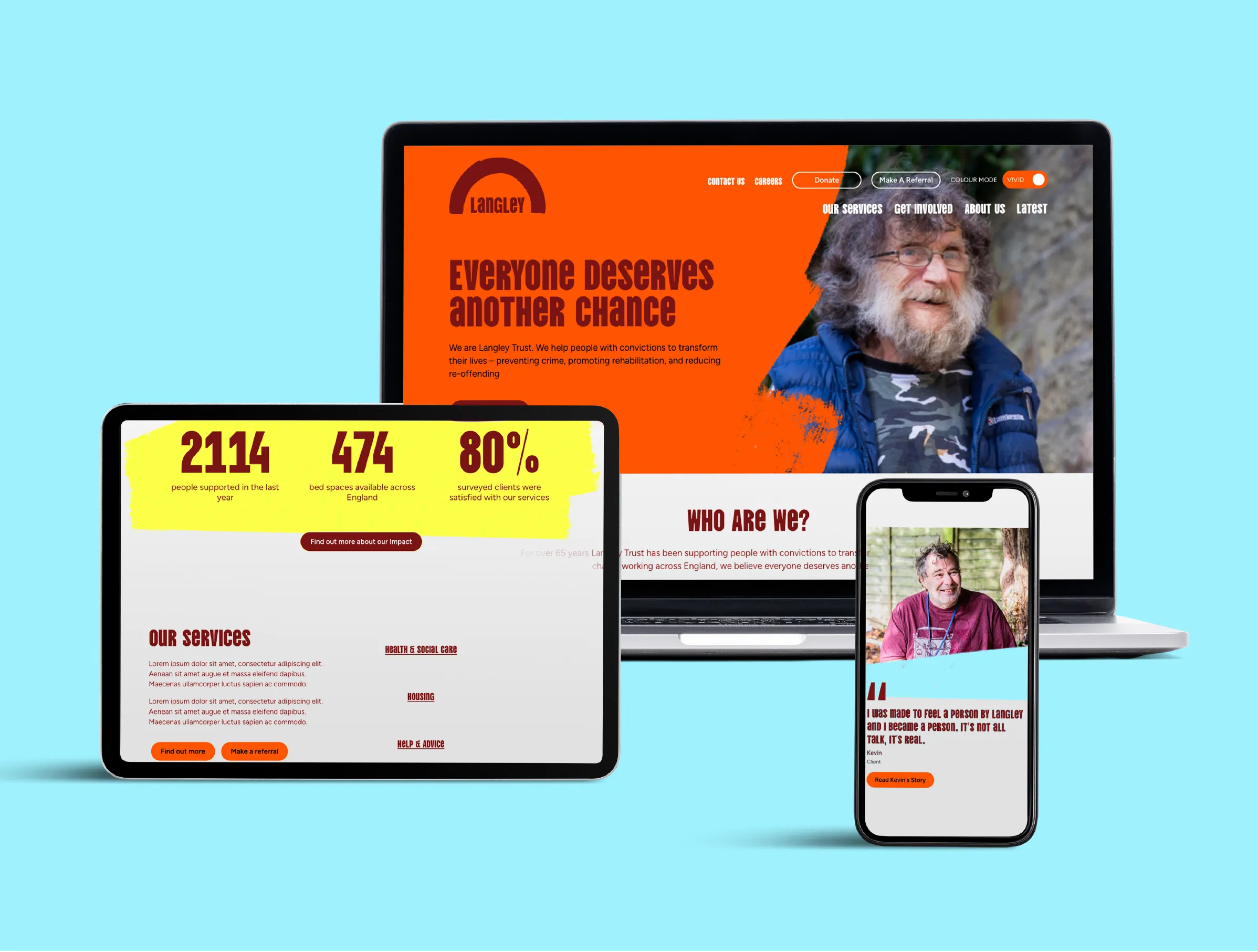
Modern WordPress website
The old Langley website was tired, clunky, and provided a poor user experience. This was holding the charity back from making the best possible use of its social media channels.
IE Digital created a new website, LangleyTrust.org to be ‘the rock at the heart’ of Langley’s online presence. It needed to raise Langley’s visibility and credibility to a range of audiences.
The new WordPress site allows the Langley team to manage their content and handle a range of enquiries, such as:
- Client referral
- Volunteer applications
- Staff recruitment
- Staffing enquiries
- Donations
- Church engagement enquiries
To ensure the site is accessible to Langley's many neurodiverse site users , we added a 'colour mode' option. This allows users to switch between the full 'Vivid' colour palette and a more 'Muted' option.
Video file
Image

We are delighted at the results: a new brand, brand guidelines, messaging matrix and a website. Despite a significant staff change at our end and Langley being a dispersed organisation, IE worked with our project leaders professionally, calmly and with the creative energy we had hoped for. Thanks IE it’s been a blast!
Rev Andy Rider, Director of Chaplaincy Services, Langley Trust
Image
65 years of Langley offering the hope of transformation to people with convictions
1000 prison-leavers housed every year
97% of people in Langley’s care remain free from reconviction
(validated by the Ministry of Justice’s Data Lab measurement tool)
(validated by the Ministry of Justice’s Data Lab measurement tool)