IE Brand works with charity, health and education clients up and down the UK, as well as internationally. Sometimes we work for large charities and universities that are household names, and sometimes we help small health and social care providers, colleges, or charity startups with big ambitions. If you’re a values-driven organisation with a challenge, then we’d love to add you to our list of clients!
- Home
- Brand Clients
Brand Clients


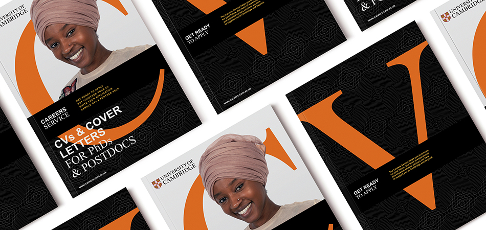
The University of Cambridge is one of the world’s top five universities. The Careers Service helps Cambridge Undergrads, Postgrads and Postdocs to prepare for their future.
Explore how we rebranded the University of Cambridge's careers service.
CloseWhat a journey it has been! We asked IE Brand to disrupt us, which they did by getting us to listen to our students and embrace the student voice in our comms. We knew the process would be painful for Cambridge at first, but we now embrace this disruption and actively seek more of it.
Amanda Norman
Thanks to the consultants at IE Brand we’ve been able to change perceptions of the Careers Service, simplify our offering, and significantly drive up student engagement at events and on social media. Our comms now stand out with a consistent new visual identity, and we feel more confident in what we are doing. Thank you!
Careers Adviser & Rebrand Project Manager, University of Cambridge
 Get in touch


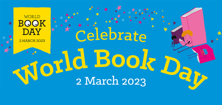
IE Brand & Digital provided intense design and development support for the rollout of World Book Day 2023. Read more on the IE blog.
CloseFrom our reading for pleasure resources for teachers and families, to the £1/€1.50 book tokens that we give to every child in the UK and Ireland, to our digital adverts, IE helped us to sprinkle World Book Day magic on our campaign assets and website.
Emma Pritchard
Manager, World Book Day
 Get in touch


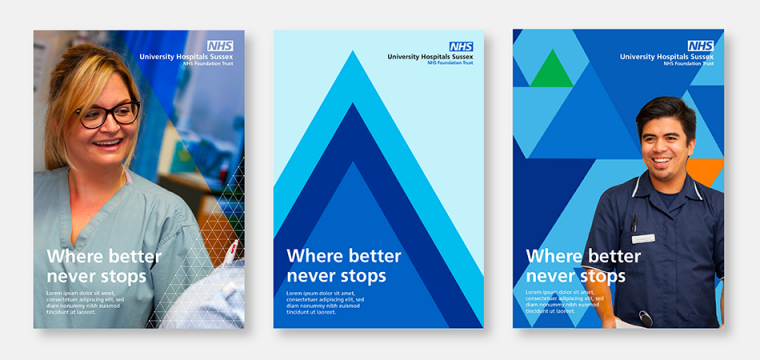
A new brand and visual identity for the newly merged University Hospitals Sussex NHS Foundation Trust.
The trust was formed on 1 April 2021 from the merger of Brighton & Sussex University Hospitals NHS Trust and Western Sussex Hospitals NHS Foundation Trust. The new trust runs 7 hospitals in Brighton, Chichester, Haywards Heath, Shoreham-by-Sea, and Worthing.
CloseWe were very impressed by the speed at which IE Brand was able to gain an insightful understanding of the distinct cultures of the two merging Trusts, and delighted by the strength and clarity of their recommendations. Their team worked at extraordinary pace to meet our tight deadlines, whilst always taking great care to listen, explain their thinking, and ensure they took us with them along the journey.
Jonathan Keeble
Director of Communications and Engagement, UHSussex
 Get in touch


IE Brand rebranded the Royal Academy of Engineering, beginning with a new tone of voice and brand messaging to encapsulate their new five-year plan. We then set about creating a modern, intriguing new visual identity and logo design.
Read the full rebranding case study.
Previously, IE worked with the Academy to create a new name, logo, brand messaging and visual identity for a sub-brand: Engineering X. This is an exciting new international collaboration founded by the Royal Academy of Engineering and Lloyd’s Register Foundation (LRF). They wanted to bring together some of the world’s leading problem solvers, united in a common aim to identify and solve the great challenges of our age.
CloseIE Brand provided invaluable support... I was impressed by how quickly they were able to grapple with and unpick our complexity, and understand the needs of our many different stakeholder groups. They were collaborative, not afraid to challenge, and eminently professional throughout. Importantly, as a client, I felt IE Brand understood and were sensitive to the challenges of facilitating such a process in-house, and as invested in delivering a good outcome as we were. Highly recommended!
Jo Trigg
Director, Communications and Engagement, Royal Academy of Engineering
 Get in touch

Queen Mary University of London (QMUL) is one of the UK’s leading universities. With over 23k students, from 160 nationalities, they are known for their international collaborations in teaching and research.
QMUL was the best kept secret in the Russell Group. They wanted to drive applications through the annual UCAS process, with one of their largest ever campaigns across outdoor media and a host of digital channels.
IE Brand delivered a bright, bold and impactful creative concept, putting students front and centre, and emphasising the university’s Diversity focus. We supplied over 50 pieces of artwork and animation, from 90-pixel gifs to bus-sides and 96-sheet billboards.
CloseIt’s not easy working on a project with challenging deadlines and multiple agencies. The whole team at IE made this process seamless for us. They developed a strong creative, managed the project and provided feedback and recommendations. Our experience with IE has been very positive with an easy and professional working relationship that has made the project a pleasure. Thank you IE. We look forward to working with you again.
Negin Parvizi
Head of UK Student Recruitment Queen Mary University of London
 Get in touch

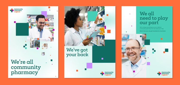
Pharmaceutical Services Negotiating Committee (PSNC) was the representative body for all community pharmacy owners in England. They had decided to rename to Community Pharmacy England, and needed a wider brand repositioning, messaging and visual identity to support their influencing work and reach a wider audience.
CloseDoing this rebrand so professionally and collaboratively, and also remaining focused on the reasons for it, has really paid off so thank you to you and all the team for getting us here. Likewise we have enjoyed working with you all and are delighted with the results.
Zoe Long
Director of Communications, Corporate and Public Affairs
 Get in touch


IE has delivered a number of digital projects for BRF Ministries.
We migrated one website from Drupal to Wordpress and combined it into a multi-network website with BRF to bring a consistent approach to all of their sites. Then we revamped the BRF website with a new look and feel. This used their existing visual identity, but incorporated some brand tweaks in response to research. Next we designed and developed a new website for Messy Church – the first to roll out across the wider BRF network.
Behind the scenes we've also been moving their shop from Shopify to WordPress, improving various systems, and more.
CloseThe new BRF website is fantastic and it looks so good. The navigation and design have just taken what we do to another level. Please can you convey our thanks to the team. Not only have we got a fabulous new website but the working together has been constructive and we have delivered the website to the deadline.
Karen Laister
Head of Marketing, Communications and Strategic Relationships
 Get in touch
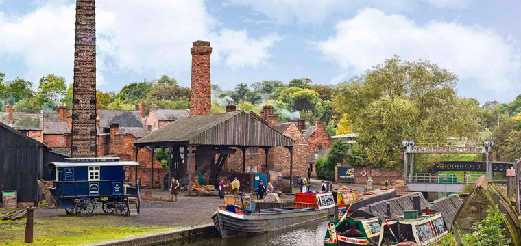
Black Country Living Museum is an award-winning open air museum that tells the story of Britain's industrial heritage. The educational charity brings history to life through an immersive experience. It's also a National Portfolio Organisation of Arts Council England.
IE Brand worked with BCLM to recreate the homes, shops and factories of 1940s, 50s and 60s Britain. We carefully restored and recreated hundreds of items, including advertising, packaging and newspapers from the period. Visitors can experience the hustle and bustle of a post-war high street, mingle with historic characters and listen to listen to 1950s vinyl in the music shop.
Close
 Get in touch


The British Psychological Society acts as the representative body for psychology and psychologists in the UK. The charity is responsible for the promotion of excellence and ethical practice in the science, education, and application of the discipline. They support and enhance the development and application of psychology for the greater public good, setting high standards for research, education, and knowledge, and disseminating our knowledge to increase public awareness.
IE has worked with the British Psychological Society on a number of campaigns and top-level consultancy projects. These include a comprehensive brand and digital audit, and a range of consultancy and campaign projects to explore the Society's membership offerings, as well building an online tool to help BPS members to navigate specialist member networks.
Close
 Get in touch


The Insurance Charity is supporting insurance people when they need it most. They offer financial support and practical guidance to current and former insurance professionals in the UK and Ireland. They’ve been helping their professional community for over 120 years, but like every brand, they needed to evolve and adapt.
The Charity commissioned IE to conduct in-depth research with people from across the industry. They wanted to listen to stakeholders to see if – and how – they needed to change.
IE Brand developed a much-needed update to their identity and messaging – injecting it with warmth and dynamism and introducing a fresh and modern look. At the same time, the Charity changed their eligibility criteria, meaning even more people could benefit from their support.
Close
 Get in touch


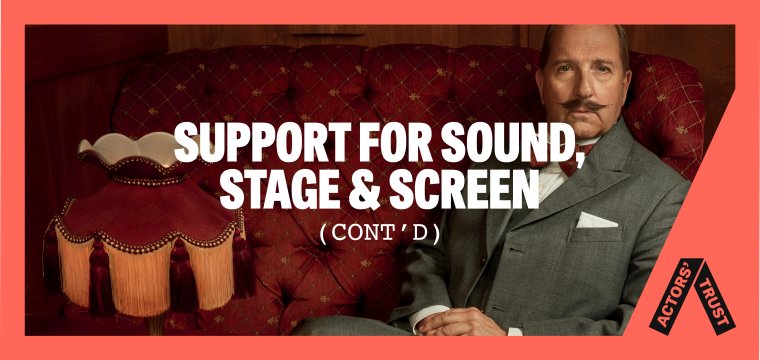
Actors’ Trust supports actors and stage managers across the UK in times of need and since 1882, the charity had been known as ‘The Actors’ Benevolent Fund’. Nearly 150 years later, low awareness, a dated website, and some bad press were all hampering the organisation’s bold ambition to increase its impact and reach within the performing arts community. Market research combined with careful member engagement pointed to the need to rename, refresh and modernise their brand to bring the charity’s exciting new strategy – Acting for Impact – to life.
CloseSo far the feedback has been incredibly positive! Going live has emphasised just how strong the new brand and website are, so a huge thank you for that. We are confident this puts us in an incredibly strong position to reach more people and have greater impact as a charity.
Alison Wyman
CEO
 Get in touch



Teach First is a charity working towards the day when no child’s educational success is limited by their socioeconomic background. IE Brand was appointed to create a campaign to tackle educational equality, kicking off a year of action, campaigning and mobilisation. The campaign needed to resonate emotionally – with anger at the injustice faced by children from poorer backgrounds, as well as a positive vision for change.
Explore the full case study for the "Challenge the Impossible" campaign.
CloseThe external perspective IE Brand brought to the project enabled us to step outside of our comfort zone and deliver an exciting and creative campaign identity that packs a punch. The conviction that IE have in their creative ideas is commendable and this really helped drive the project forward when obstacles were met. Feedback from internal stakeholders and our wider network of alumni and partners has been positive.
Hayley Orrell
Brand & Marketing Officer - External Relations Division, Teach First
 Get in touch


Family Action is a UK charity that provides practical, emotional, and financial support to families in need. Founded in 1869, they help families facing issues around domestic abuse, mental health problems, learning disabilities, and financial hardship.
Last year, they supported 60,000 families and helped 350,000 children to eat a healthy breakfast.
Family Action asked IE to refresh their brand and build them a new user-centred website.
CloseIE came to the pitch with a really impressive understanding of our complicated charity and what we needed to achieve with our limited budget. They delivered on time, thoughtfully and creatively, and were unfailingly generous with their time and expertise. Director, lead designer, junior designer – everyone went the extra mile – to the point of offering pro bono time to support one of our young people with a logo design, giving them a taste of life of at an agency and helping them bring their idea to life in such a professional but also kind way. Down to earth, friendly, with an absence of jargon and an acceptance of unforeseen challenges, IE made the process of refreshing our visual identity as easy as it could be, while integrating it with a major web redesign.
Jenni Bacon
Head of Brand Development
 Get in touch


