L'Arche
Client
L'Arche
Services
Stakeholder engagement & research
Brand messaging
Visual identity
WordPress website
Brand guidelines
Charity Marketing
Charity Web Design
Industry
Charity
Health charities
International Charities
International federated charity L’Arche came to IE with a storytelling challenge. They were struggling to articulate what they do, and wanted to re-energise the organisation following a recent inquiry.
L’Arche (French for ‘The Ark’) is building a world where assistants and people with intellectual disabilities – core members – live together, work together, and learn from one another as they co-create community. The international charity has 154 communities and 19 non-residential projects across 38 countries, where people live together, work together, and learn from one another. They build communities together, where they enrich each other's lives.
Through clearer messaging and a joyful, unified visual identity, L’Arche can now move forward confidently for its next phase.
Image
Listen
Understanding L'Arche
L’Arche had a brand messaging problem.
L'Arche has a remarkable history, but the narrative had focused heavily upon its charismatic founder, Jean Vanier. Since his death and an inquiry into his conduct – which the charity handled with great integrity and sensitivity – there was a strong desire to reframe their story, placing the voices of people with intellectual disabilities firmly at its heart.
There were other brand issues stemming from L’Arche’s federated model. They wanted to re-evaluate the role of the L’Arche International parent brand and its relationship to country brands. They also had some fundraising challenges.
L’Arche hoped that a rebrand and new website would re-energise the organisation, raising awareness and contributing toward achieving their fundraising goals.
Engaging with stakeholders
IE Brand & Digital was appointed to develop both the brand and website. L’Arche used IE’s brand brief template to provide a detailed overview of their ambitions for the project, as well as our website brief template to explain their website requirements.
Our brand and digital consultants immersed themselves in these briefs and conducted an audit of the existing brand and its marketing comms.
Further research followed, in the form of qualitative interviews with major donors and other TIE stakeholders – Thinkers, Influencers and Enablers. We also held two immersion workshops with stakeholders to get to know the organisation better.
IE then made a series of behaviour changing recommendations to L’Arche, which shaped the creative work that followed.
Image
Image
Working across multiple languages, cultures and contexts, IE approached our challenges with sensitivity, skill, and insight: to help us re-articulate our core proposition. The resulting messaging and visual identity have helped to increase unity internationally and will allow us to harness the combined power of our global brand for the first time. They have also been extremely supportive, helpful and easy to work with!
Heather Coogan, Director of Public Engagement, L'Arche
Image
Image
Image
Advise
Recommending a new approach
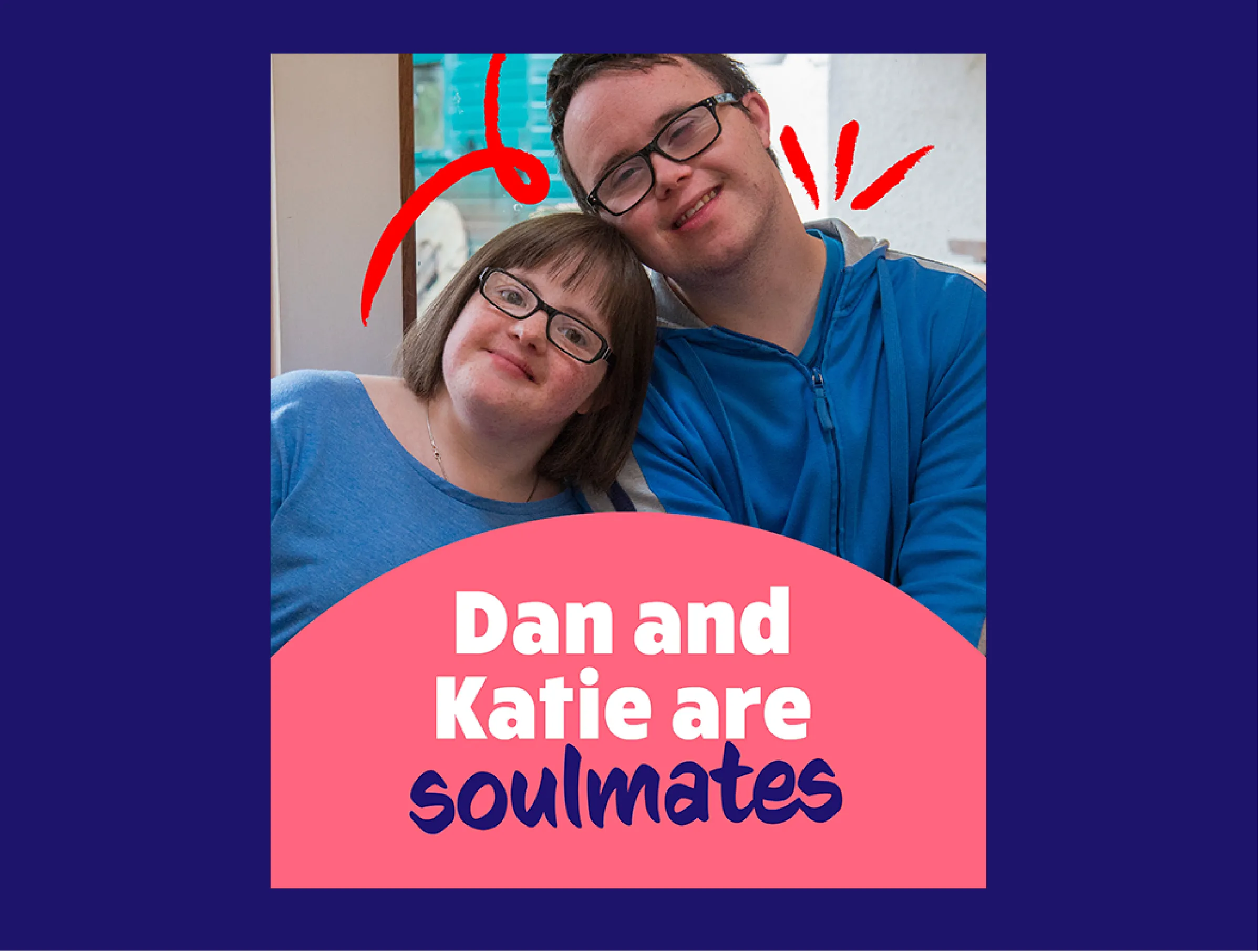
Our research told us that audiences still enjoyed hearing the story of how L’Arche was founded. They simply needed to shift the emphasis towards Philippe and Raphael. These were the two men who, in 1964, joined Jean Vanier in the very first L’Arche community, or Ark.
Philippe and Raphael gave and received friendship and were recognised for who they were as individuals – regardless of their intellectual capacity. Ever since, the charity’s mission has been to create a society where people with and without intellectual disabilities live as friends and equals.
Philippe and Raphael were just the beginning of an inspirational new model. The L’Arche model moved people away from the shocking institutionalised care that was more common at the time.
Finding the true story of L’Arche
The story of L'Arche, as told from the perspective of Raphael and Philippe, already existed. Hugely powerful and resonant, it simply needed to be promoted as the true story of L’Arche.
And while Jean Vanier did not live up to all of his own ideals, the ideas that form the basis of L’Arche still hold enormous equity. They’ve pioneered a new model of diversity and inclusion, which is hard-baked into L’Arche communities. As an organisation, they needed the confidence to share these ideals with the world.
But putting what L’Arche is into words was a challenge. They found it hard to convey the feeling of L'Arche, without someone experiencing it for themselves.
We needed to find a unifying language to describe the organisation, one that is both authentic and easy to understand. Any description of L’Arche should intrigue people enough to want to experience it for themselves – ideally through a physical visit to a community, and meeting core members and assistants.
Experiencing L’Arche through film
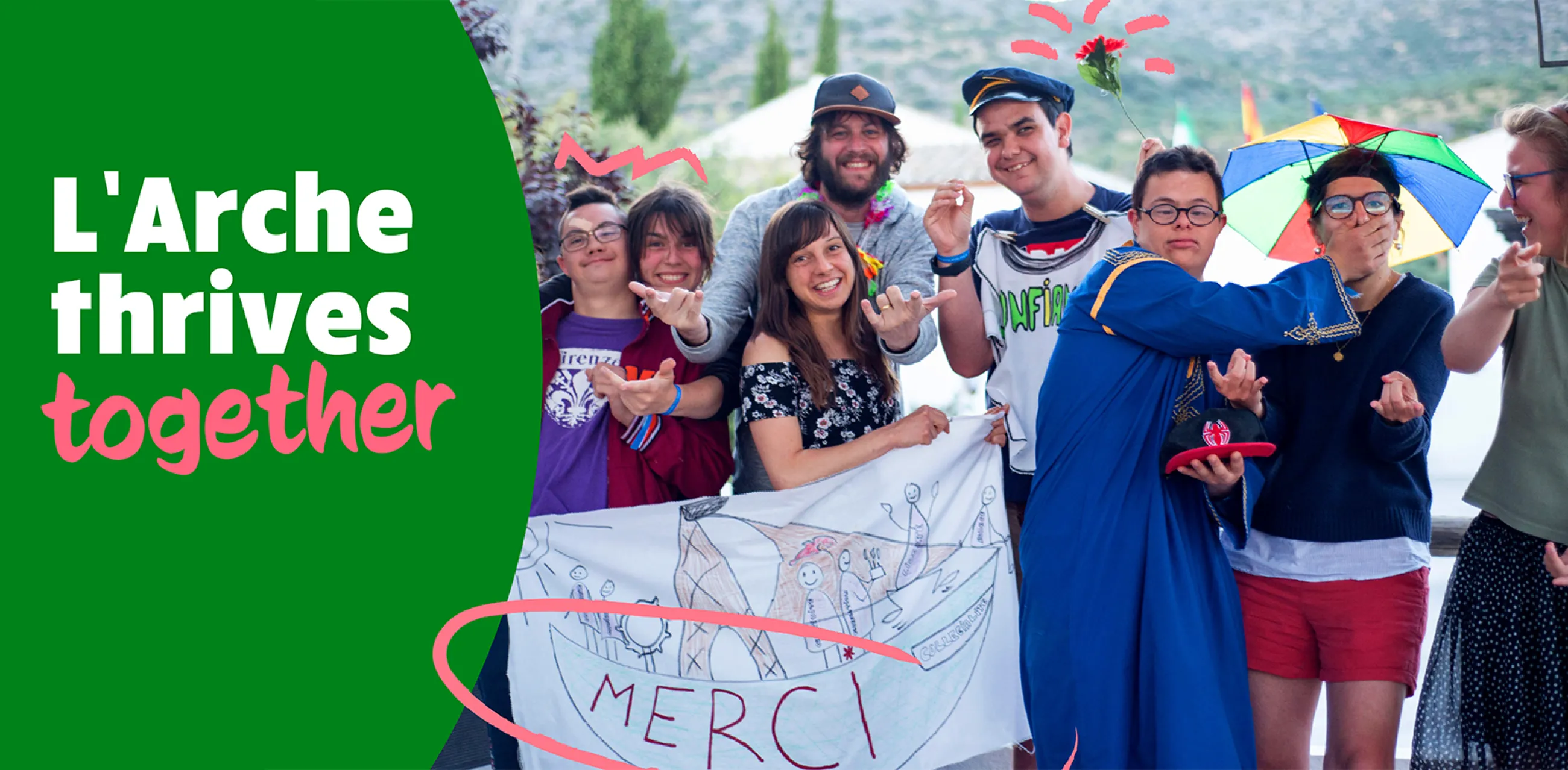
L’Arche already had some fantastic films that capture the character and humanity of core members, and celebrate the relationships between them and assistants. We needed to bring these films to the fore as much as possible, to share their sense of belonging and community.
These films are supported by photography from within L’Arche communities, testimonials, and written storytelling.
Uniting behind the international brand
We also encouraged L’Arche to stand together as a global movement, rather than getting bogged down in the differences between the different country-based communities.
L’Arche looks different in different cultures, and that will always be one of its great strengths. But that need not prevent L’Arche from uniting under a strong, global brand. Instead, they can now celebrate their global reach, not least because research showed that scale and global reach were key factors influencing trust and confidence among key audiences.
Further recommendations, seen as more fundamental questions for the charity, are being explored as L’Arche develops its new charity charter. This is the process of restating L'Arche's core principles, purpose and way of operating as an organisation.
Image
Image
Deliver
Creating a unified L'Arche brand
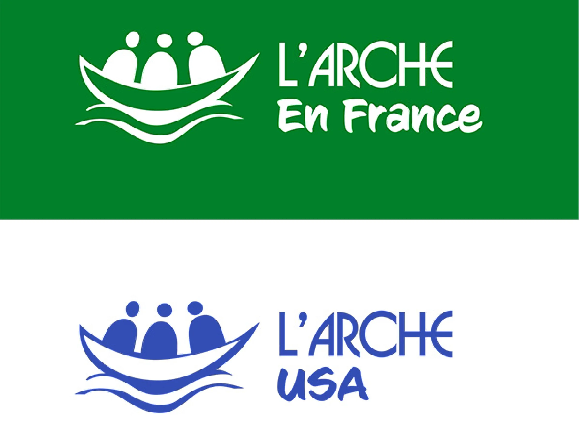
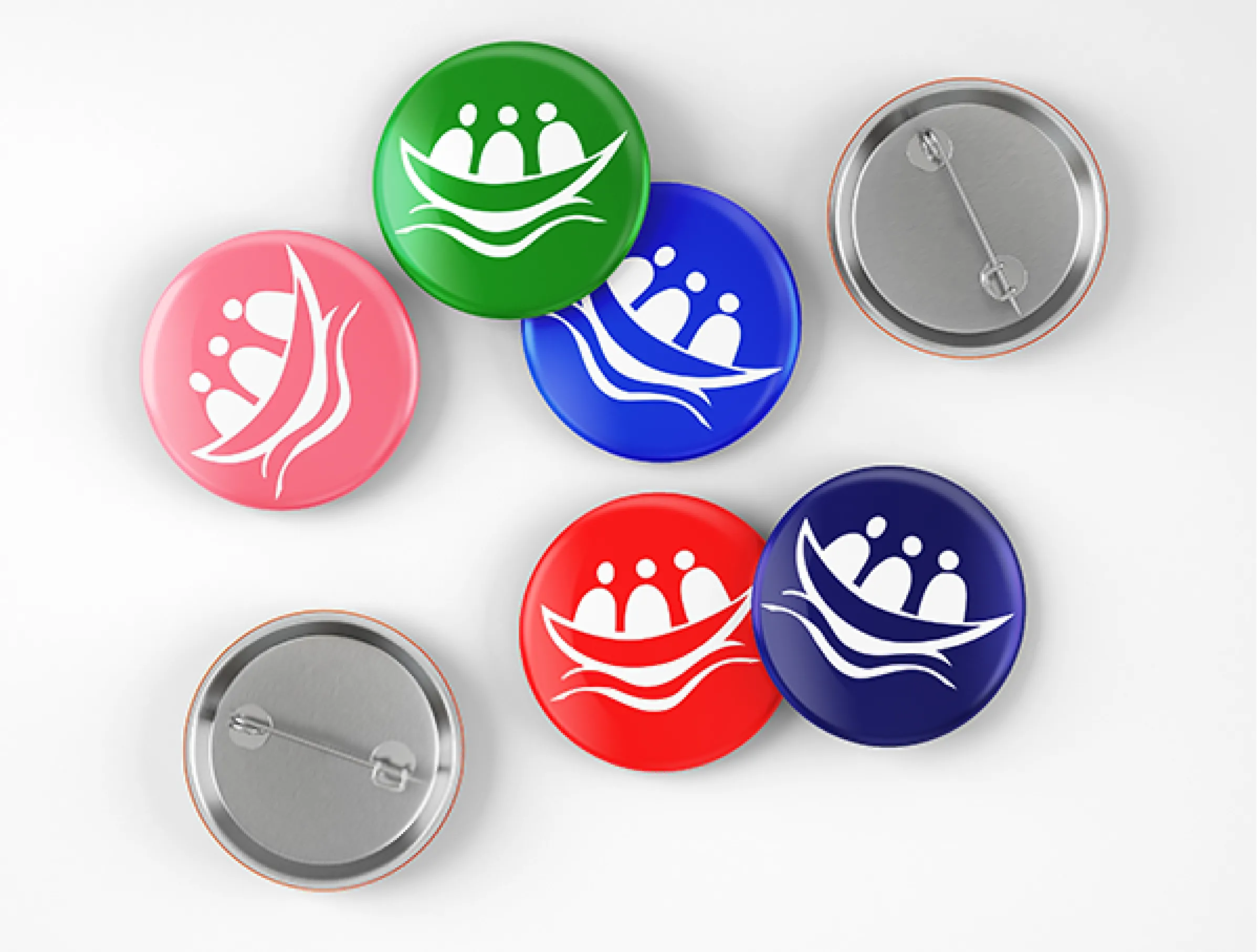
The parent brand – L’Arche International – became simply L’Arche.
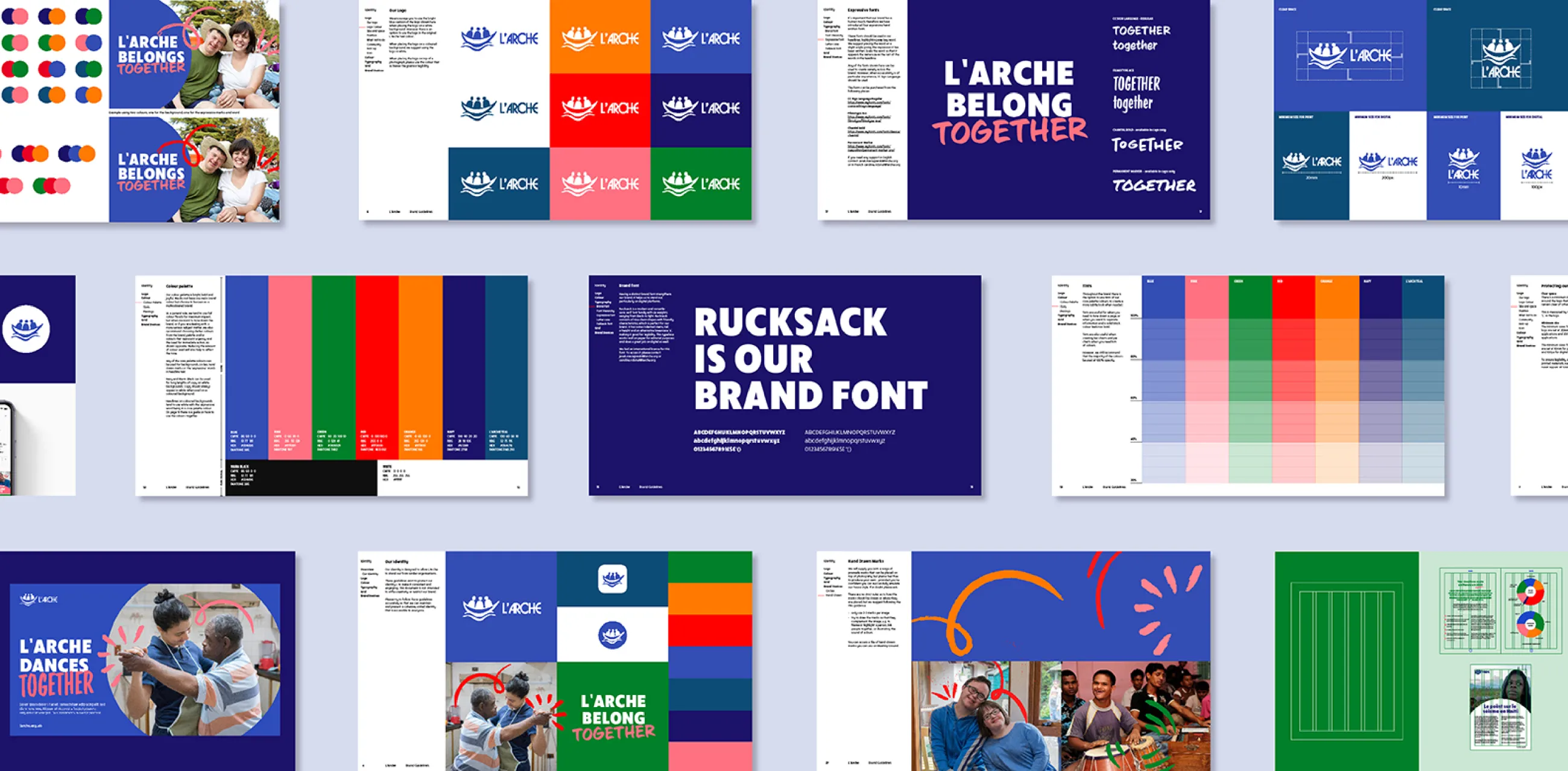
The L’Arche logo features three passengers in a boat to represent an ’Ark’. Changes to the icon were out of bounds due to the challenges of gaining buy-in and the practicalities of rolling out such a fundamental change globally.
Instead, IE Brand introduced a new font for the logo lock-ups featuring country-based and individual community names, to ensure consistency around the world.
United brand messaging
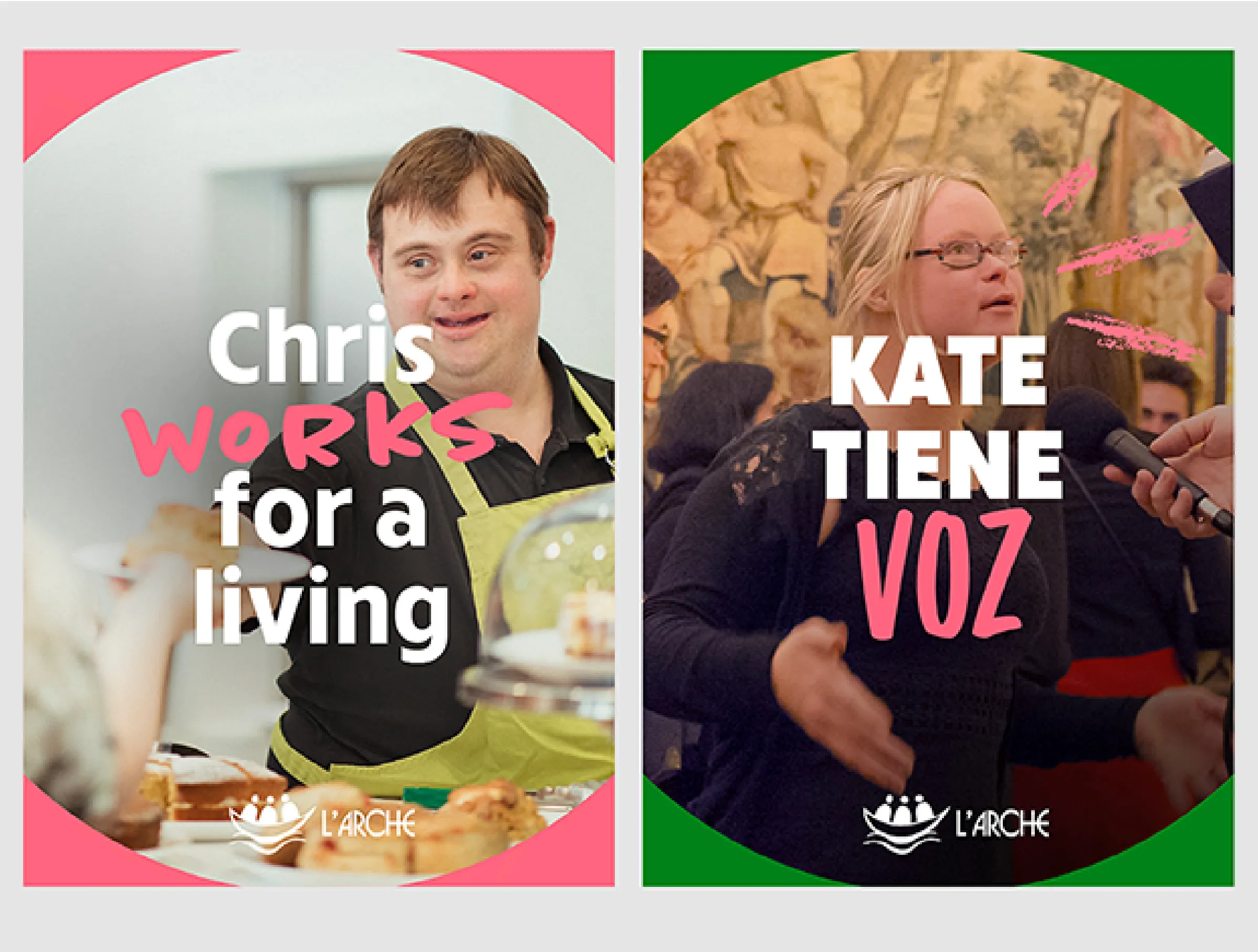
The new brand messaging for L’Arche simplifies how they talk about themselves.
Through what we heard in our research, IE defined their core beliefs, brand personality, and messaging for different audiences. At its essence, the brand is loving, fun, rooted and united.
It’s crucial that L'Arche's messaging distances its from institutions and care facilities – L’Arche is a meeting of equals, and its watchword is ‘with’, not ‘for’. Lives are transformed, but that’s equally true for assistants as it is for core members.
A new brand messaging matrix outlines the drivers, messages and calls to action for prospective assistants – mostly young people – to attract them to volunteer in a L'Arche community. We also created messaging for people with intellectual disabilities (core members and prospective core members) and their families, along with donors, funding bodies, partners, influencers and alumni.
Campaign messaging focuses around simple phrases that, alongside film and photography, provide a glimpse of what life is really like in a L’Arche community:
- L’Arche lives together
- L’Arche works together
- L’Arche belongs together
- L’Arche learns together
- L’Arche dances together
- L’Arche discovers together
- L’Arche laughs together
- and many more
Finally, we created a strapline for L’Arche: Together. With and without intellectual disabilities.
A joyful, authentic visual identity
The new visual identity needed to be versatile enough for global communities, while reflecting a sense of renewed clarity and togetherness. By each adopting a common visual platform, L’Arche can strengthen its communication and harness its combined power as an international movement.
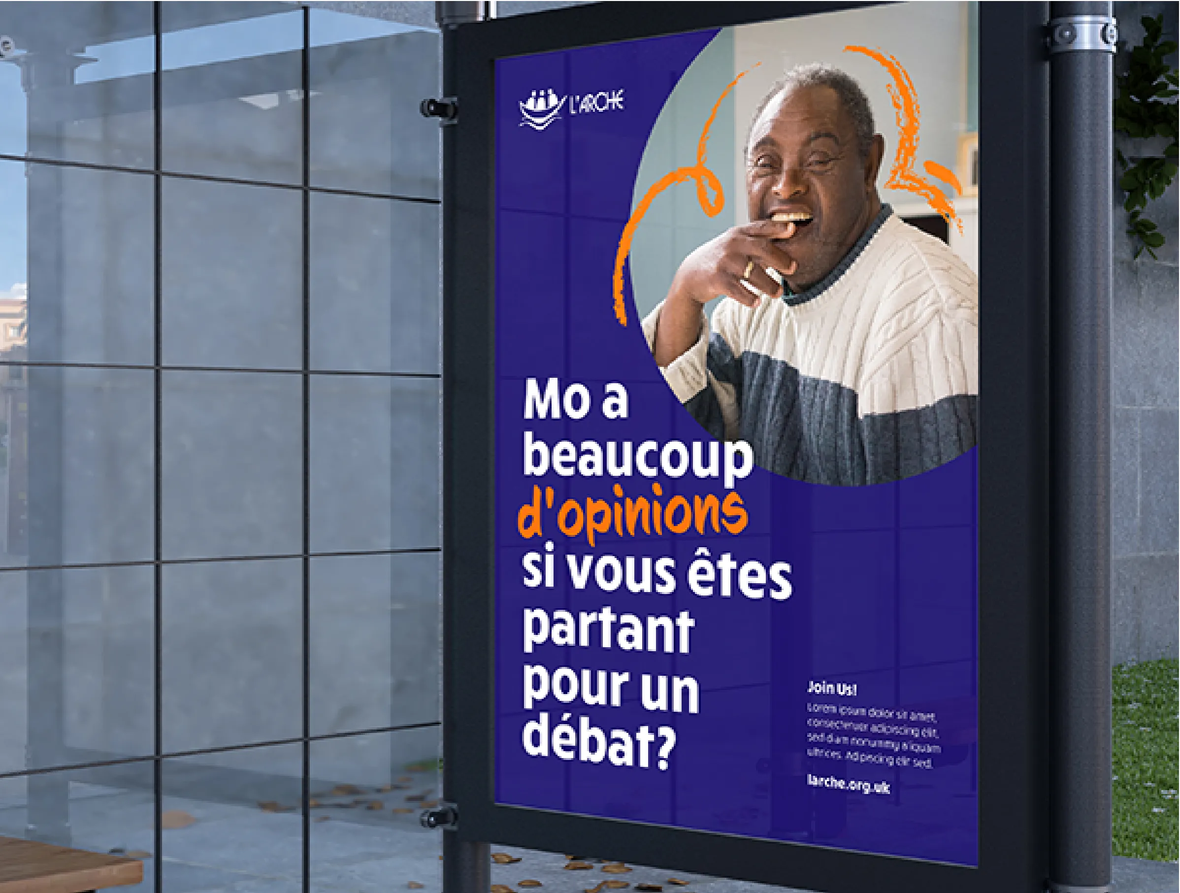
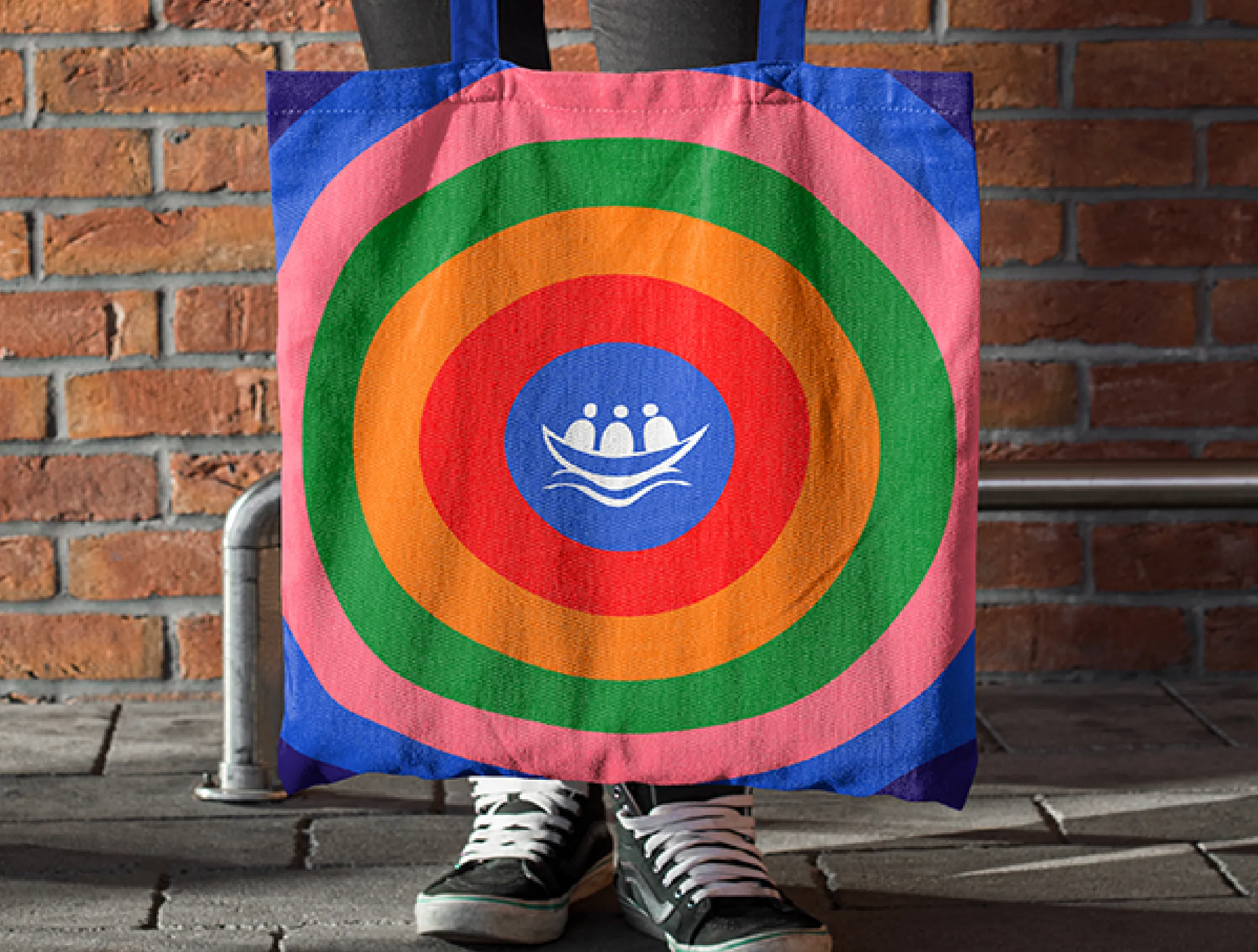
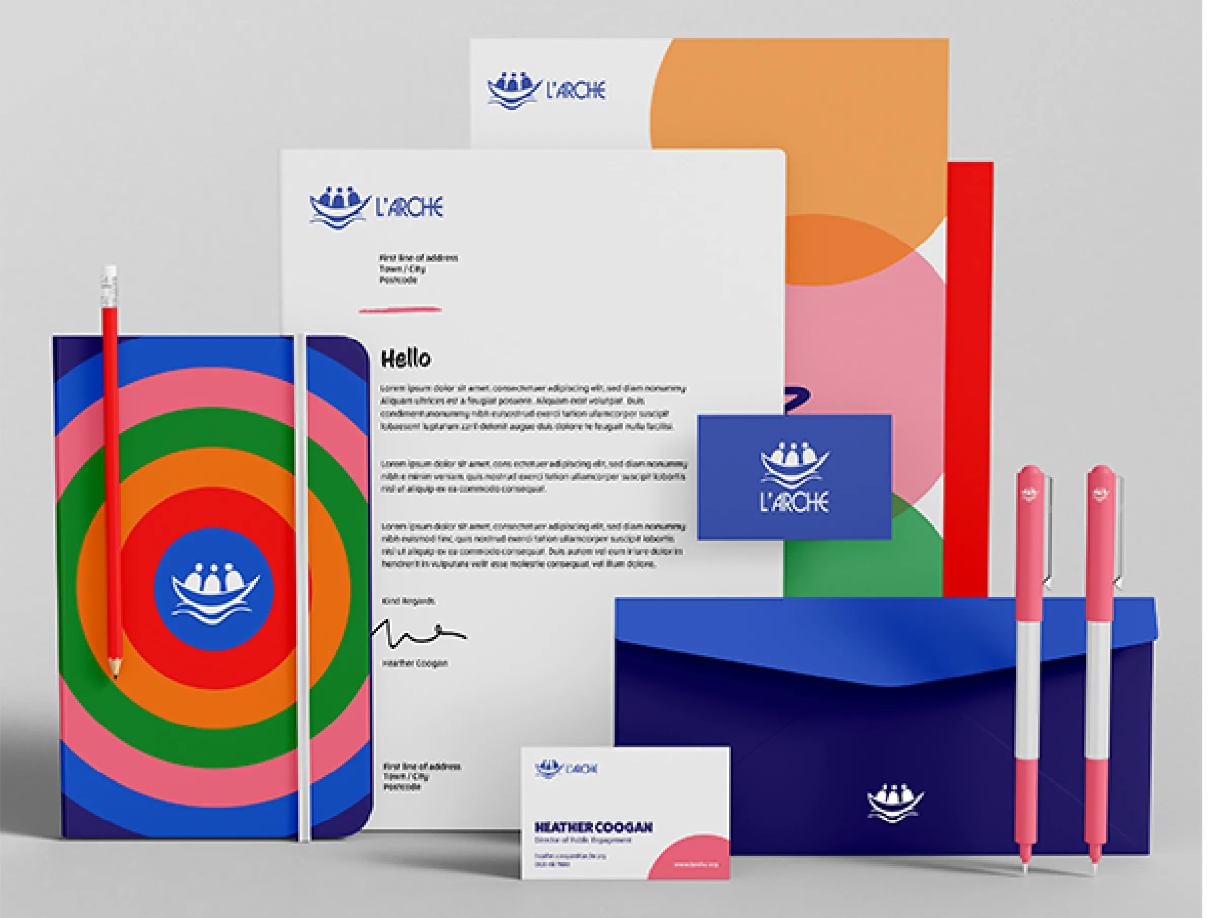
The brand personality is authentic, inspirational, diverse, spiritual, respectful, compassionate and a little bit quirky. IE created a new colour palette that’s bright, bold and joyful, just like life within L’Arche. The option to use their traditional teal colour remains, but the vibrant palette encourages a universal shift to a brighter shade of blue. This is complemented by pink, green, red, orange and navy, along with black, white, and a range of tints.
It’s a multi-coloured brand that can flex according to local cultures and preferences. Where possible it looks great with up to three colours used side by side, but it can easily be dialled down by using fewer, darker colours for more serious use cases.
Real people, real lives
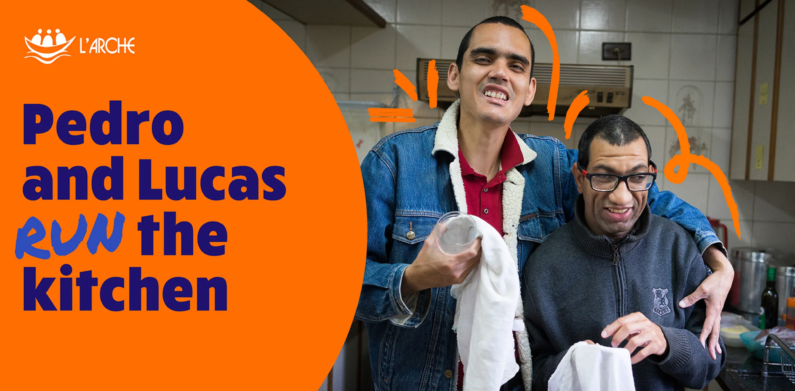
L’Arche already had a huge bank of excellent photography showing real communities in action. They never need to fall back on stock photography, instead they can share the natural warmth of real members and assistants.
To give photographs a more distinctive feel, we introduced a range of hand drawn marks to help to make the already joyful photography feel alive. This complements a set of four expressive hand-drawn fonts, chosen to give typography a human touch and compliment the main brand font, Rucksack. One of these, CC Sign Language, is used for the country lock-ups and is the preferred choice when accessibility is particularly important.
We also use circles throughout the brand’s comms, both in colourful patterns and as a containment device for photography, copy, and illustration.
Protecting the new, global brand identity
All this is explained through a set of brand guidelines, giving local communities a framework for consistency, while allowing them to focus their creativity on stories, photos, and films that really express their mission. The guidelines include numerous examples of how the new visual identity can be applied in practice, from stationery to social media, tote bags to banner ads.
Image
Image
Image
Support
New brand, new website, new confidence
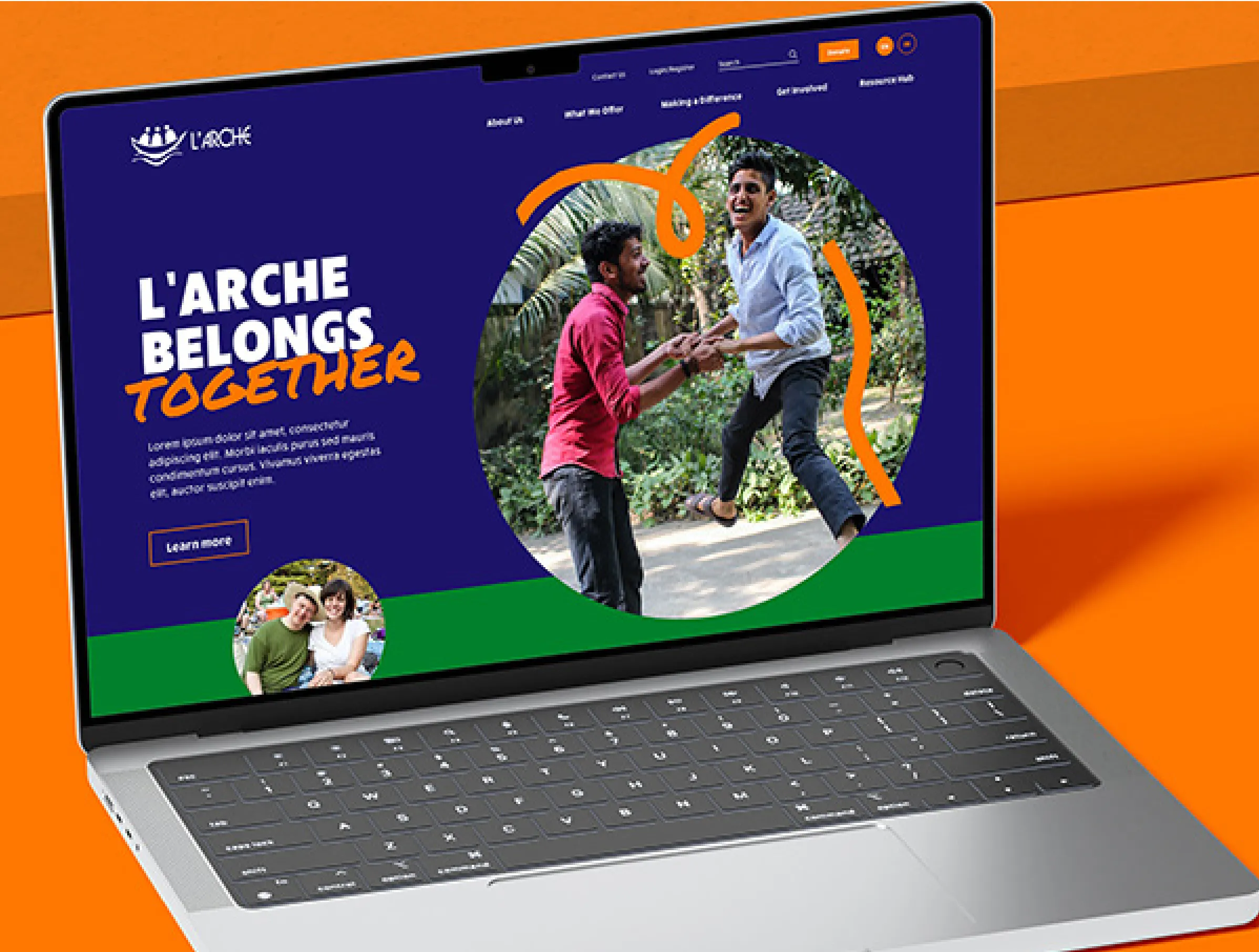
IE also built a brand new global website for L’Arche.
The site supports both English and French language versions, and there’s opportunity to explore L’Arche communities all over the world. The website brings together all of the fantastic films, photography, testimonies and stories to illustrate what life is life at L’Arche, to show the transformative effect it can have for both members and assistants.
L’Arche now has the confidence to talk about the impact it has internationally. Wherever you are, you can see stories from communities all across the globe – from the UK and Canada, to India, Zimbabwe, or Japan.
As L’Arche enters a new chapter and develops its new charity charter, it can do so with renewed confidence and a brand to be truly proud of.
L'Arche communities and projects in 38 countries
200 million people have an intellectual disability – 2.6% of the world’s population
Over 150 communities and nearly 30 projects, from Argentina to Zimbabwe