Community Pharmacy England
Pharmaceutical Services Negotiating Committee (PSNC) had decided to change their name to Community Pharmacy England. The rename was part of a repositioning and rebranding project that was to change the organisation at a fundamental level, led by IE’s stakeholder research.
Community Pharmacy England is the voice of England's 11,000 community pharmacy owners. They represent and support their members, negotiate the best deal with the Government and NHS, and influence positive change. Because everyone in society needs community pharmacy to thrive.
IE Brand helped Community Pharmacy England to reposition at a fundamental, behavioural level, and contributed to this important membership organisation regaining the confidence of its members. The rebrand and visual identity supported this work, bringing Community Pharmacy England closer to the community pharmacies they represent. They now look and sound the part, able to earn respect with both sides of the negotiating table, while conveying a brand personality based on warmth, trust, dedication, and effectiveness.
The community pharmacy sector plays a vital role within local communities and is central to primary care within the health service. But community pharmacies are under more pressure than ever and cannot survive without the right support.
Background
Pharmaceutical Services Negotiating Committee (PSNC) (now Community Pharmacy England) is the representative body for all community pharmacy owners in England. They are responsible for negotiating contractual arrangements for the sector with NHS England and the Department of Health and Social Care (DHSC), to agree the best terms for services and prescription medicines.
For the 11,000+ community pharmacies they represent, these deals account for around 90% of their income. That means that PSNC’s negotiating role is central to the livelihoods of its members.
A change of name and focus
PSNC also champions and supports the sector in other ways, and they wanted to step up their influencing work. They felt a change of name and a stronger brand would help them reach a wider audience beyond the sector: policymakers, patients, third sector partners, and the media.
To better represent the sector, they had already decided to change their name to Community Pharmacy England. IE Brand was appointed to support the organisation through the rebrand.
Stakeholder listening and research
IE conducted an in-depth brand audit and held 2 internal perceptions workshops with key people at PSNC.
We ran an esurvey with members from the community pharmacy sector, which received 237 responses. The findings of the survey helped us to shape the in-depth one-to-one stakeholder interviews that followed.
IE acted as a critical friend, sharing challenging research findings with PSNC and making recommendations for organisational behaviour change, as well as branding and visual identity.
Findings and recommendations
Among pharmacy owners, awareness was good, but PSNC’s reputation was poor. They were seen as out of step with their membership. Members doubted that PSNC was working hard enough towards the best deal, and felt they were too closely aligned with the NHS and DHSC. The valuable work being done by PSNC was being overlooked – instead the brand had become a lightning rod for struggling and disillusioned pharmacy owners.
This was an important moment for PSNC, who embraced the opportunity to reposition the organisation, re-engage their members and rearticulate their story.
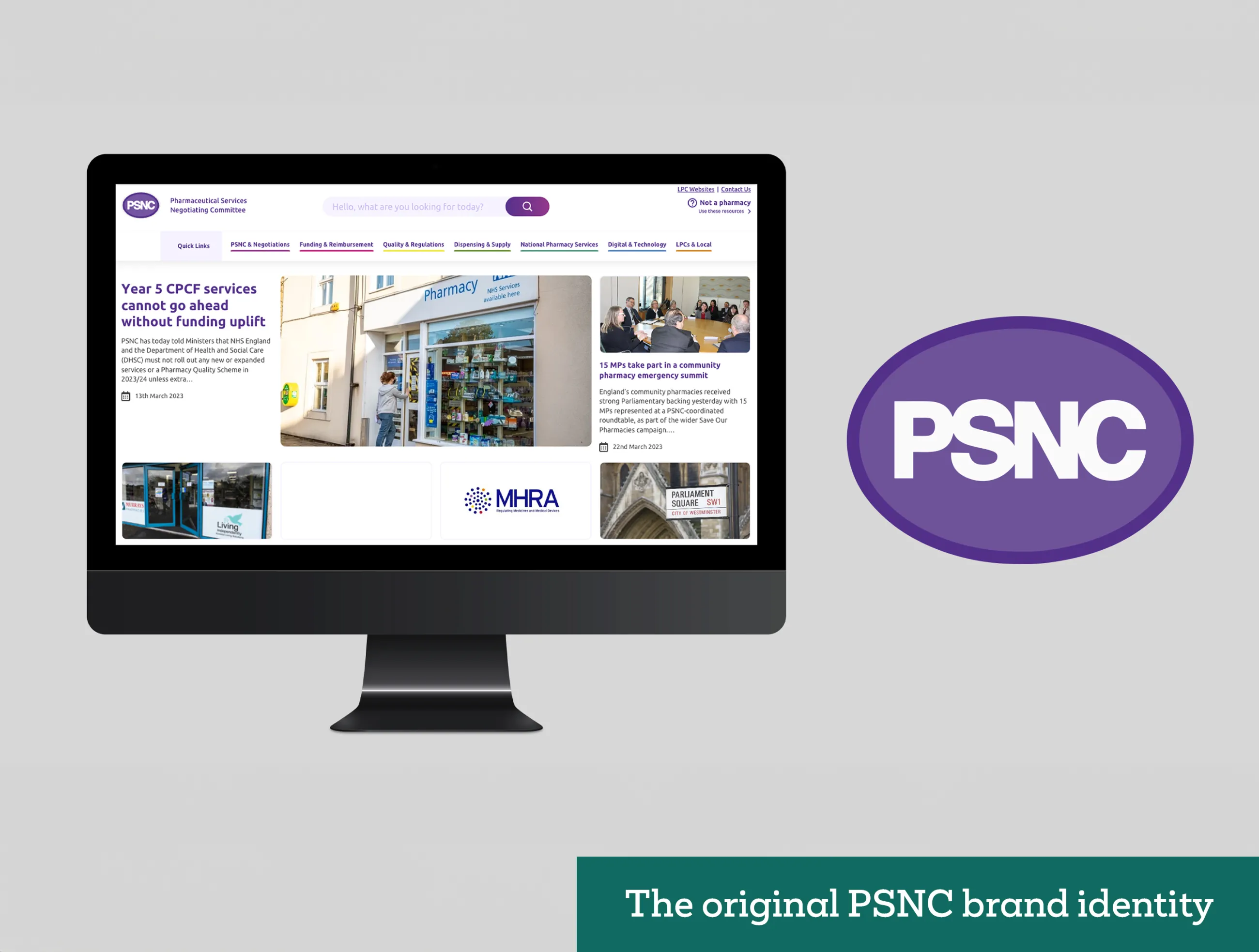

IE made a series of recommendations based on the research, first and foremost for behaviour change.
In the current social, economic and political climate, PSNC simply can’t deliver everything that community pharmacies want and need. There was no ‘big win’ around the corner to reset perceptions of the organisation – improvement would be slow and take other forms.
For the new Community Pharmacy England brand to become the champion of community pharmacy the sector needed, IE recommended:
- even greater transparency with members (wherever practically possible) in its negotiations with NHS England and DHSC
- be seen to advocate for the community pharmacy sector and fight for wider change
- provide pragmatic solutions to members’ problems in the shorter term
- openly manage expectations in the context of a challenging environment and controlling the narrative when sharing unpalatable news
- educate members about the vast amount of work you do on their behalf outside of and beyond the negotiation cycle – celebrating your many successes
In this way, Community Pharmacy England would gradually become the champion the community pharmacy owners told us they needed: assertive, proactive, collaborative, knowledgeable, transparent, open-minded and respectful.
Walking the walk
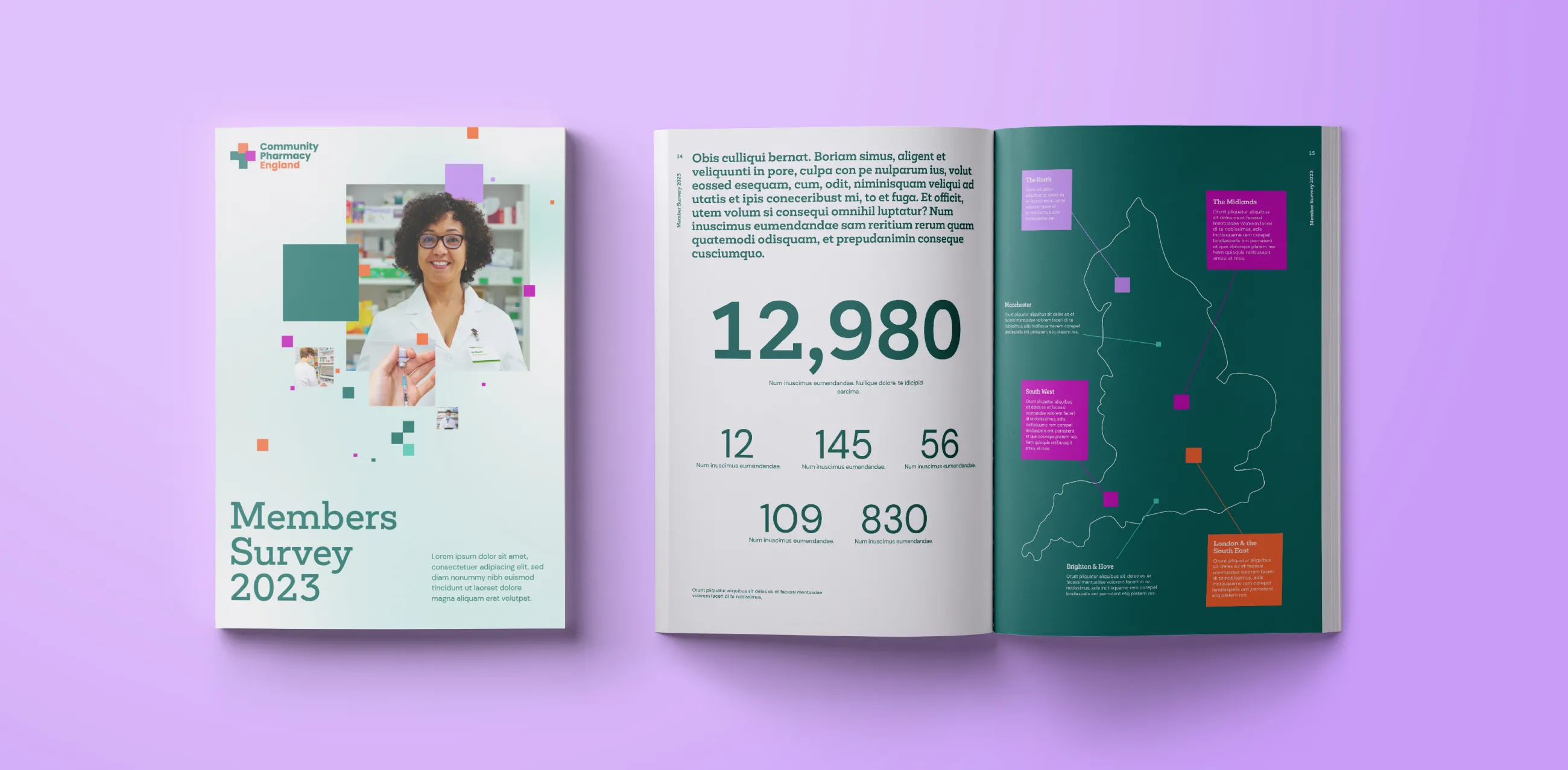
PSNC almost immediately launched a Pharmacy Pressures Survey, consulted stakeholders about their new communications and engagement strategy and – along with other leading pharmacy bodies – launched a ‘Save Our Pharmacies’ campaign. Members noticed the effort and appreciated the change. It was a big step in the right direction.
IE’s next job was to create a new brand to signal this change.


One important aspect of Community Pharmacy England's new messaging was how it referred to its core audience – the community pharmacy owners. Previously known as ‘Contractors’, that name wasn’t strictly accurate and, crucially, felt rather cold. Contractors became known as Members, in a move to reset the relationship and communicate belonging.
Talking to members
To help members recognise the value Community Pharmacy England delivers, the brand messaging focuses on three core themes:
- Realism – Always explain the context in which Community Pharmacy England operates – socially, economically, or politically
- Honesty – Manage expectations about what’s possible by being open with members
- Positivity – Celebrate the achievements of Community Pharmacy England and the sector as a whole
Community Pharmacy England’s new tone of voice conveys a personality that’s warm, welcoming and empathetic to their members. Their language reassures members and gives them confidence in Community Pharmacy England as a proactive, effective champion for their cause. Their words also convey that Community Pharmacy England is expert, influential and transparent.
Collaborating for positive change
The new Community Pharmacy England brand is based on collaboration with two key audiences: pharmacy owners of all sizes, and decision makers – like the Government and NHS – and those who influence them. The brand messaging needed to maintain a healthy, constructive dialogue between all parties, without alienating anyone.
Community Pharmacy England is needed now more than ever, and the brand needed to demonstrate a clear voice in both behaviour and comms. They now state what they believe far more boldly on behalf of the sector, inviting conversation to effect positive change.
Testing the new brand messaging
IE Brand tested and socialised the new brand messaging with Community Pharmacy England’s audiences, including various representatives from Local Pharmaceutical Committees.
We also socialised the new name as part of IE’s research. Rather than save it for a ‘big reveal’, we shared the name with stakeholders ahead of the relaunch. The change from Pharmaceutical Services Negotiating Committee to Community Pharmacy England met with approval from stakeholders.
A visual identity that feels part of the community
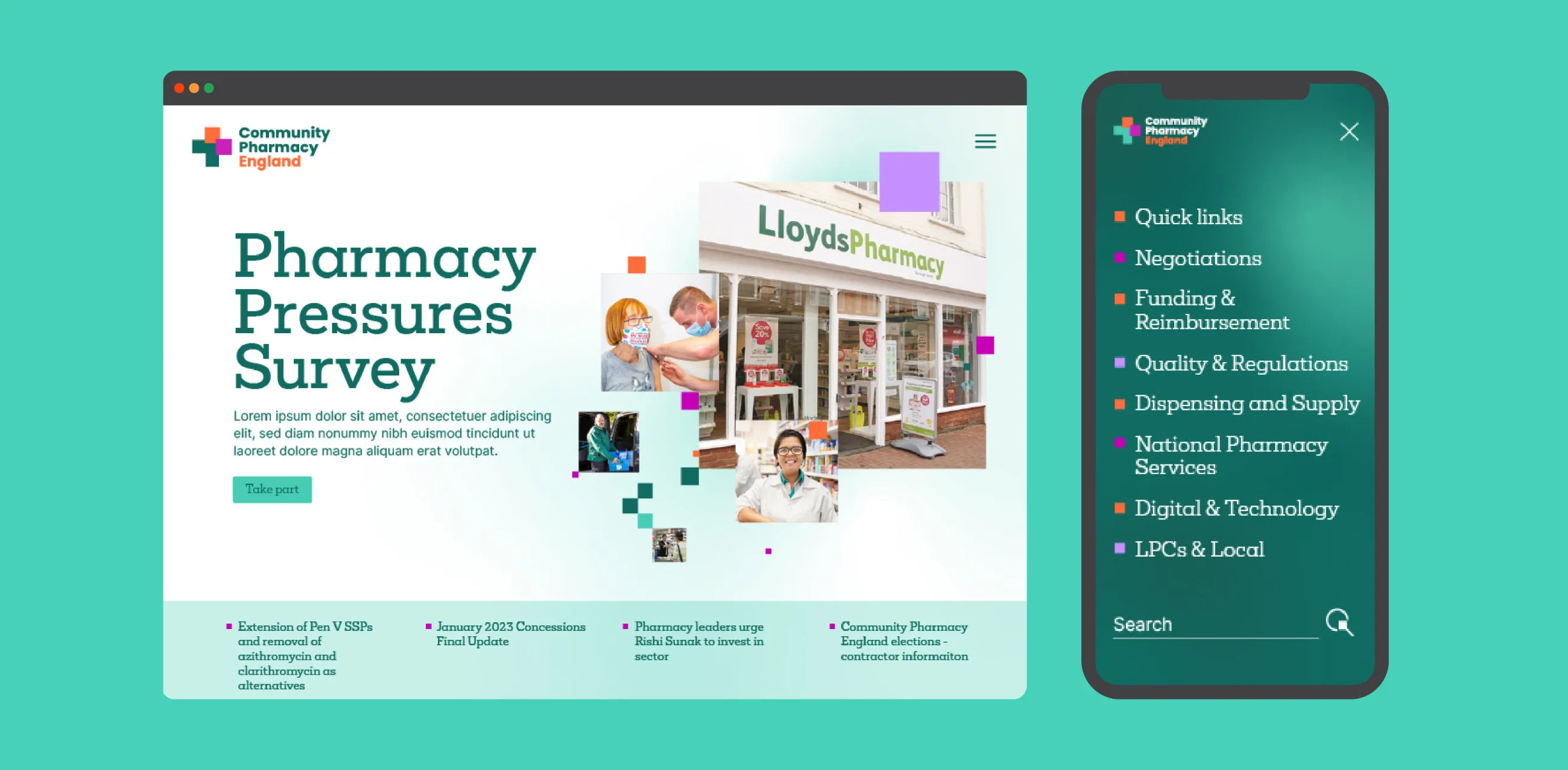
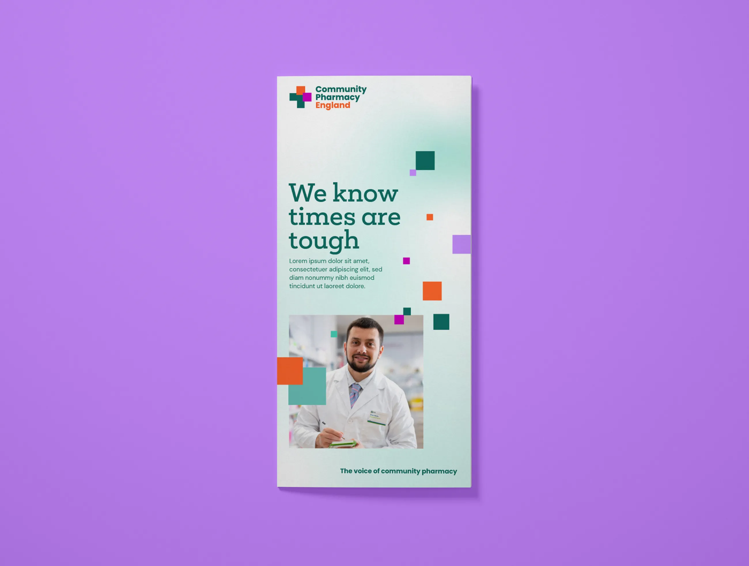
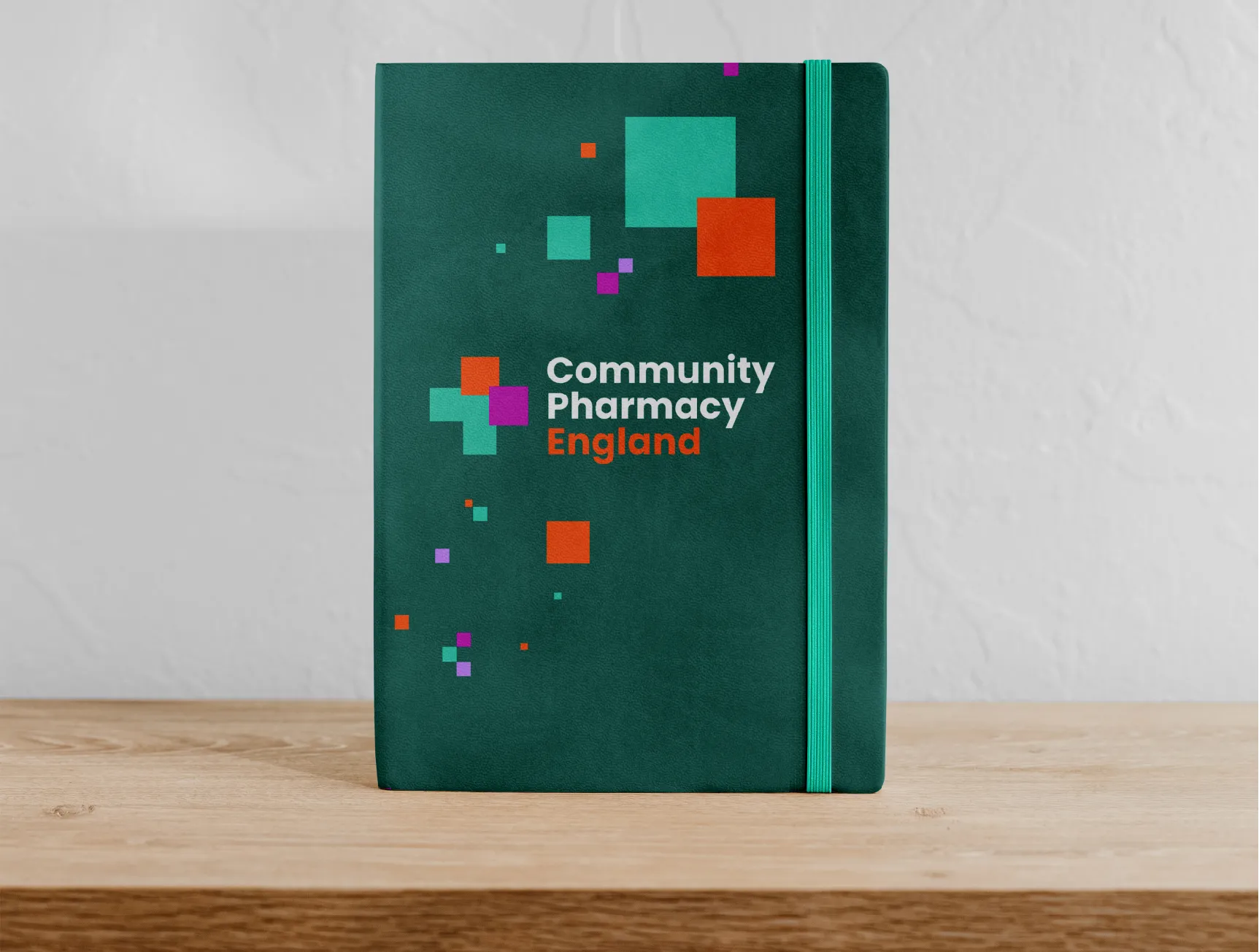
To reflect the sector it represents, Community Pharmacy England needed to look more like a pharmacy brand. The green cross has been synonymous with pharmacies in England since the 80s, so we embraced the symbolism in the new logo to show unity with their membership. The brand’s core colours are Aqua and Forest Green, taking centre stage along with accents of Tangerine, Magenta, and Lilac.
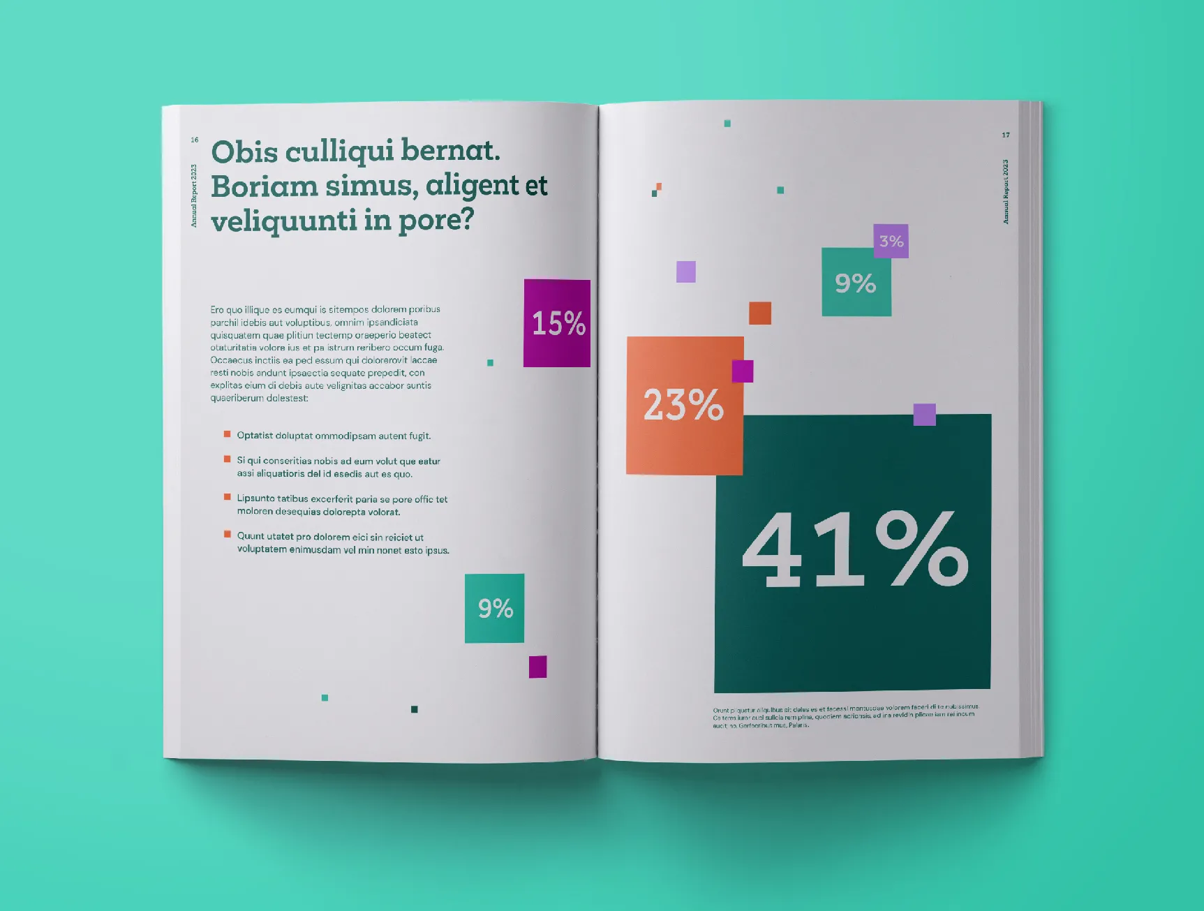
The visual identity also takes inspiration from the murmurations and flocking formations of birds in flight. We created a pattern based on these, consisting of squares drawn from the logo in a variety of sizes and colours. This symbolises Community Pharmacy England uniting the sector and getting the best deal for members.
IE Brand also created a bank of bespoke photography, shooting real pharmacists in real pharmacy locations. Photography cut outs, unique background gradients and a set of icons complete the flexible visual identity.
We also looked at brand architecture, creating a logo lockup for use by the 68 Local Pharmaceutical Committees. To set these apart from the parent brand, Community Pharmacy England chose a blue variant of the core colour palette.
Launching the new brand
Thanks to the client’s hard work to change behaviours, by the time the new visual identity launched on 1 June 2023, perceptions of the organisation had already begun to shift in the right direction.
Community Pharmacy England noted that the rebrand received hardly any pushback from members – a huge achievement and progress from the dissent among members just six months earlier.
The work was Highly Commended at the Transform Awards in the category 'Best Visual Identity in Healthcare and Pharmaceuticals'.

IE Brand created a set of brand guidelines to demonstrate how to create impactful design compositions.
We also created a suite of artwork and templates to enable the Community Pharmacy England team to design an array of comms materials – from reports and email newsletters to banner stands and social media.
