WDP
Image
Client
WDP
Services
Renaming
Repositioning
Rebranding
Visual identity
Messaging and Tone of Voice
Website
Charity Marketing
Charity Web Design
Industry
Charity
Health charities
Health
Other healthcare
IE Brand was appointed to help WDP – then named Westminster Drug Project – communicate its vision and achieve its ambitious growth plans.
Formed in 1990, WDP is a charity providing drug and alcohol services in London, the South East and the East of England. The charity was going from strength to strength – improving the health, wellbeing and social integration of service users. However, it was no longer a project, its geographical reach extended far beyond Westminster, and its services now encompass more than drug addiction support.
The name had become unhelpful and the charity needed to redefine its brand, and bring subsidiary organisations into the fold.
Image
Listen
Stakeholder interviews and market positioning
Westminster Drug Project had outgrown its name and brand, and was now delivering almost a third of drug and alcohol treatments in London.
To reposition the brand, IE Brand began with a comprehensive listening exercise to identify the charity’s ‘brand essence’. We held qualitative stakeholder interviews with WDP’s service users and staff across all levels – from support workers to board level executives – to find out how they perceived the organisation. We also spoke to Commissioners from the various NHS Trusts to understand their views.
Feedback from service users revealed they were genuinely grateful to the charity for the compassion and assistance they’d received in helping them with their dependency problems. They felt WDP’s service had been more caring and personal than other similar organisations, and the work was having a life-changing effect.
This people-centric approach was a key differentiator from other organisations with a more ‘clinical’ approach. Service users also provided valuable insights on messaging, for example that the word ‘addiction’ was a turn-off to service users, for whom it had very negative, painful connotations.
Both service users and staff exhibited a strong sense of loyalty and togetherness at the local level. However, there was a limited sense of relationship to the parent brand and WDP’s expansion strategy wasn’t widely understood. Some parts of the organisation had negative perceptions of others, creating a challenge when trying to unify the brand.
IE Brand also carried out competitor mapping, competitor analysis and a market positioning exercise.
Image
IE Brand demonstrated an impressive level of insight in supporting WDP through a significant rebranding exercise. Quickly managing to grasp our vision and our values, IE delivered a fantastic new brand and style that we are sure will serve WDP well for many years to come.
Sue Clements, Chief Executive
Image
Image
Advise
Renaming and messaging
Following the Listening phase, IE Brand recommended that the new Westminster Drug Project brand identity needed to project a larger, more confident identity.
We advised them to build on the reputation of being a people-focused charity. That was what made them special, while also reassuring commissioners they provide a ‘safe pair of hands’, capable of managing clinical risk.
Naming and brand architecture
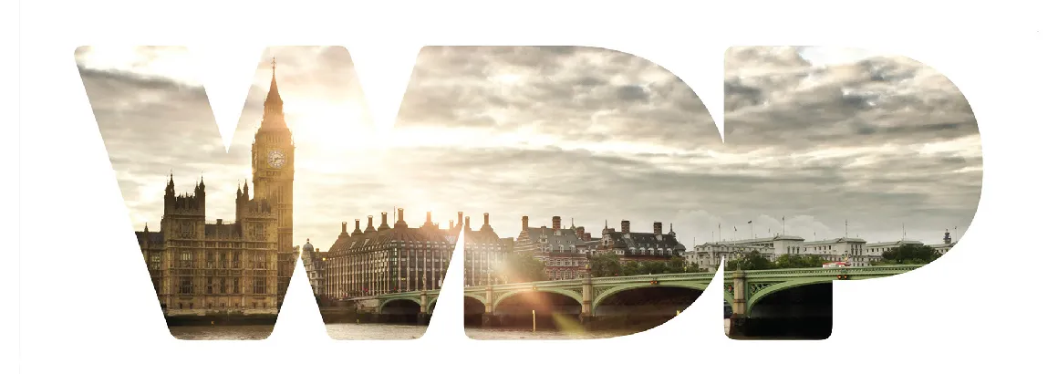
It became clear we needed to eradicate the words Westminster, Drug and Project from the name, while keeping the WDP acronym, which was already in regular use and retained some positive brand equity.
We looked at a range of options but in this case, the best answer was also the obvious one, so WDP officially became the organisation’s new name.
This wasn’t a ‘one size fits all’ solution, so IE Brand created an overarching brand architecture and logo system to provide some consistent flexibility to allow sub-brands to make a gradual transition to WDP.
Messaging, Tone of Voice and Strapline
We analysed the key words commonly used across all of WDP’s competitors as well as WDP itself.
It was clear that people were key for WDP, who typically used warmer, more personal words and phrases, such as ‘support’ where their competitors might employ a more medicalised term like ‘treatment’. IE’s proposed messaging for the charity leveraged this caring, warm and supportive nature, while also projecting an effective, results-driven service provider.
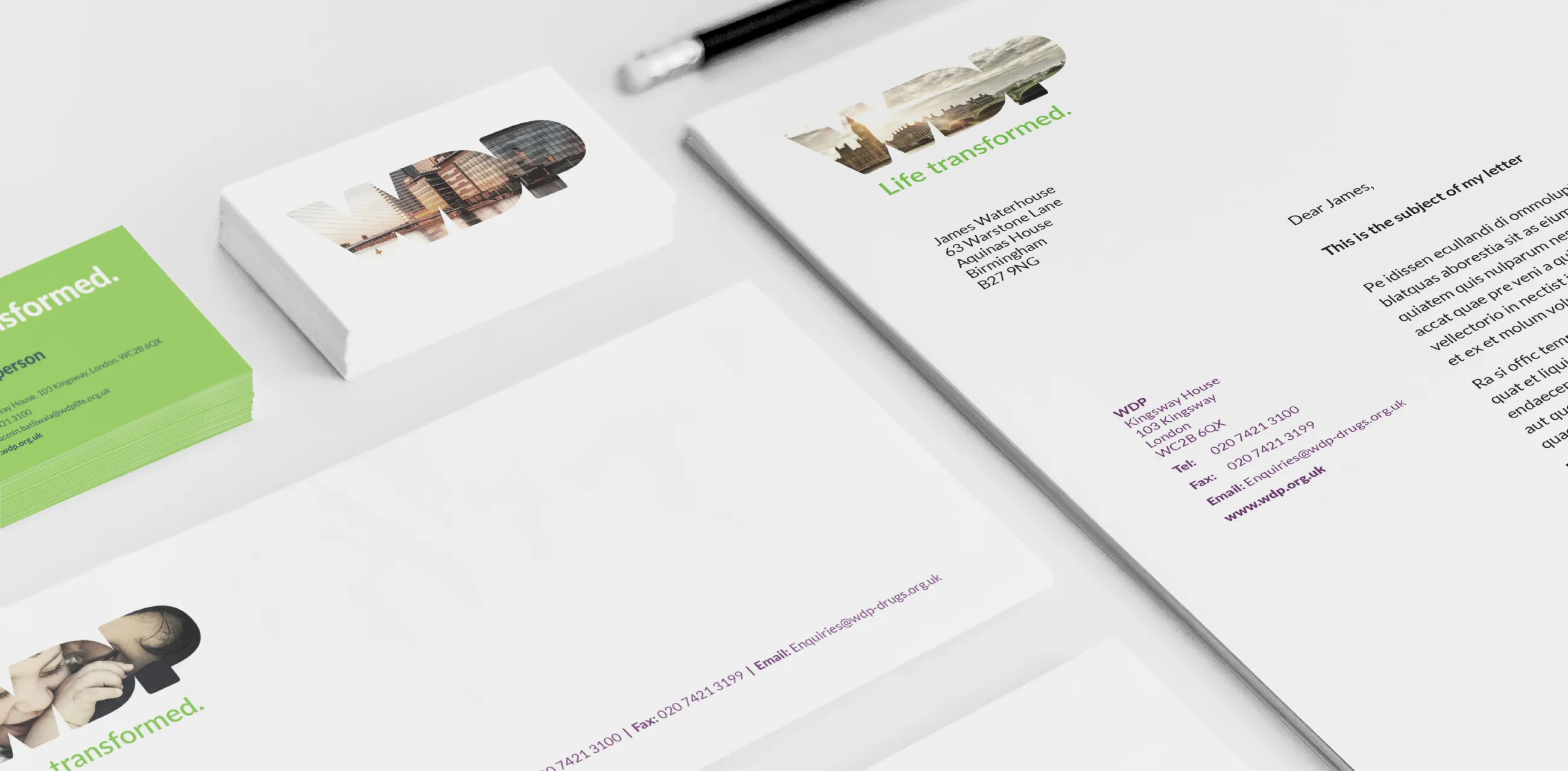
WDP also needed a descriptive, positive and warm strapline that would resonate with Commissioners and service users, to provide meaning alongside the WDP lettering. IE centred the new brand messaging around the words 'Life transformed.', an aspirational phrase reflecting the life-changing effects of the charity’s work on its service users.
Image
Deliver
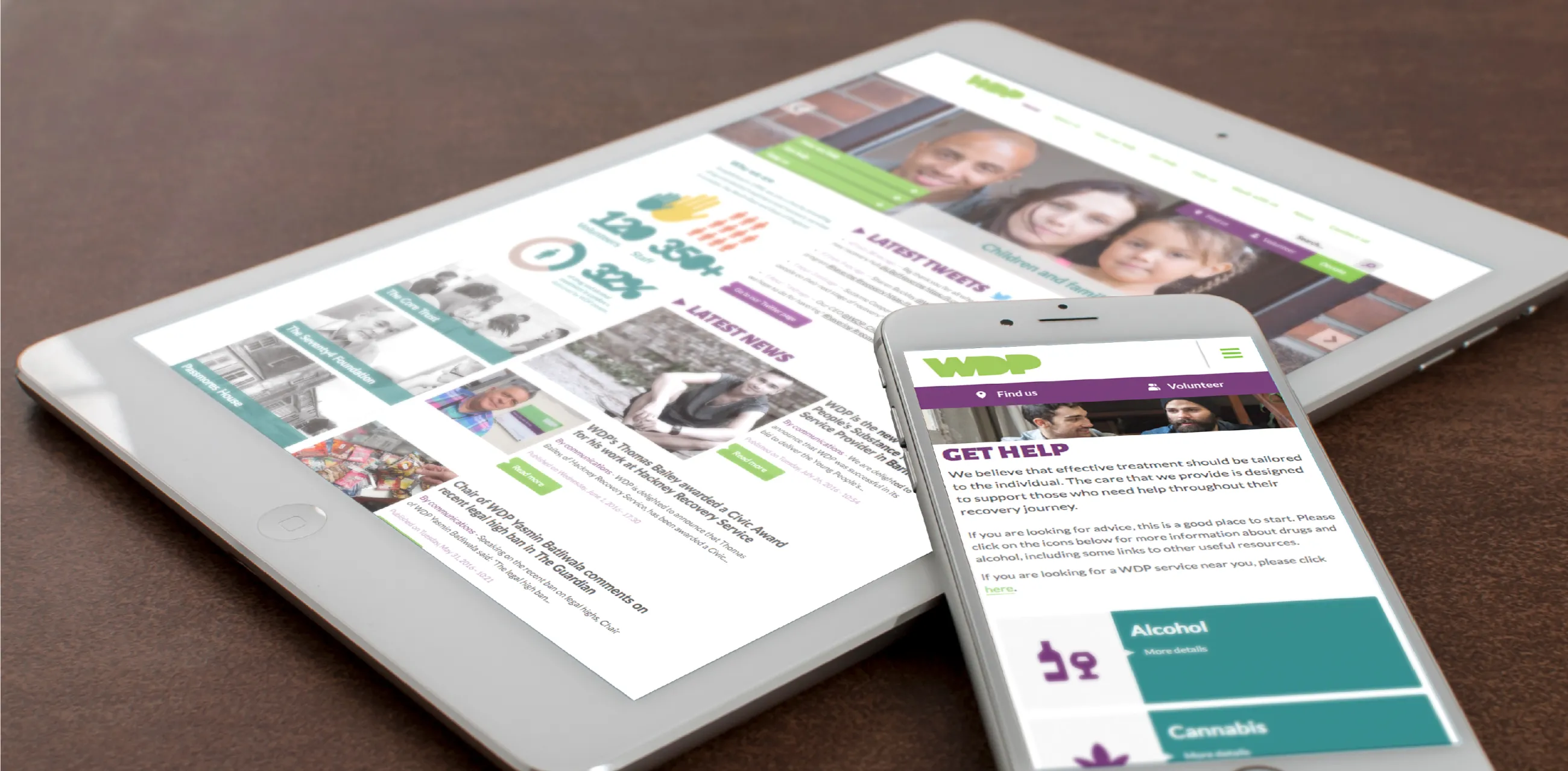
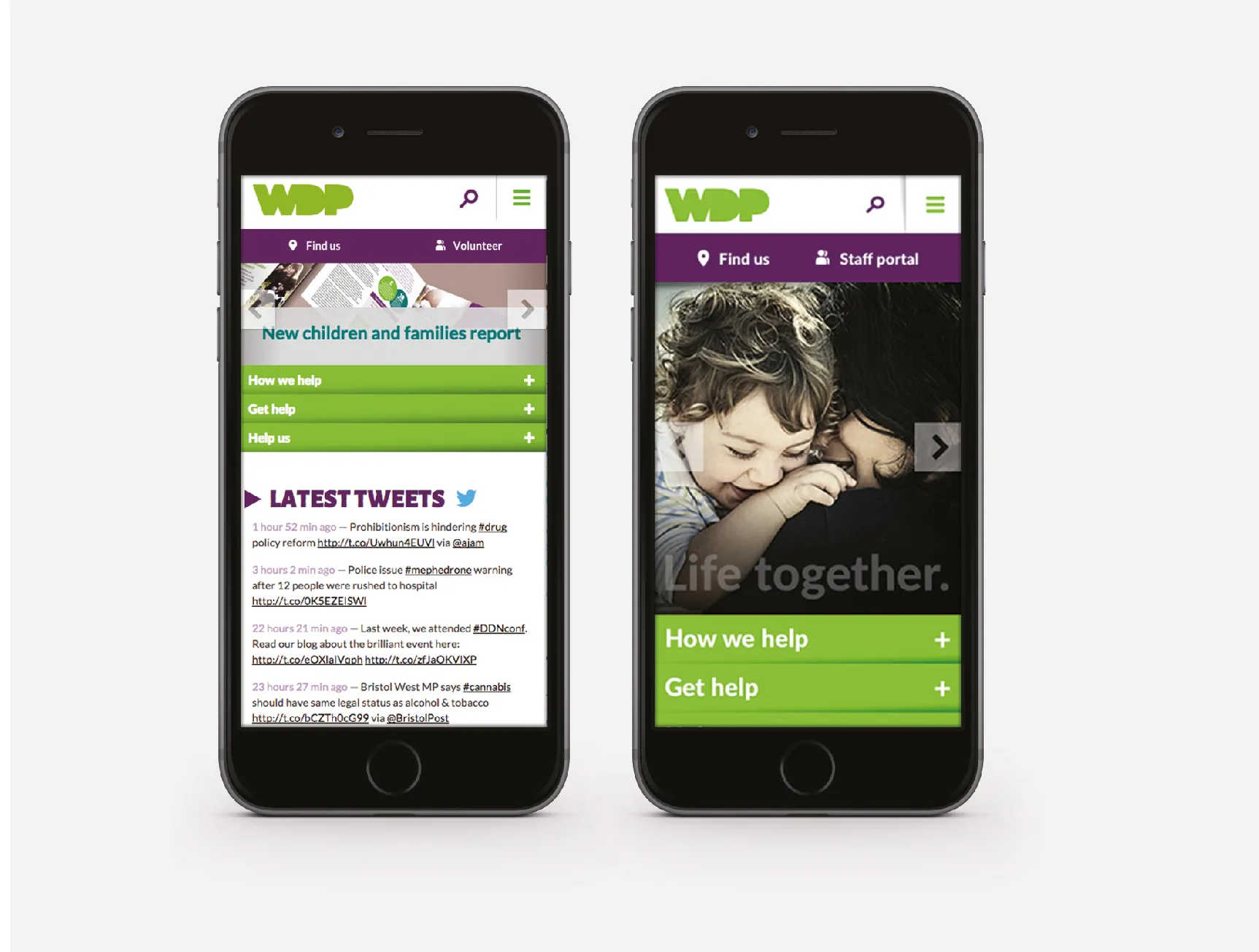
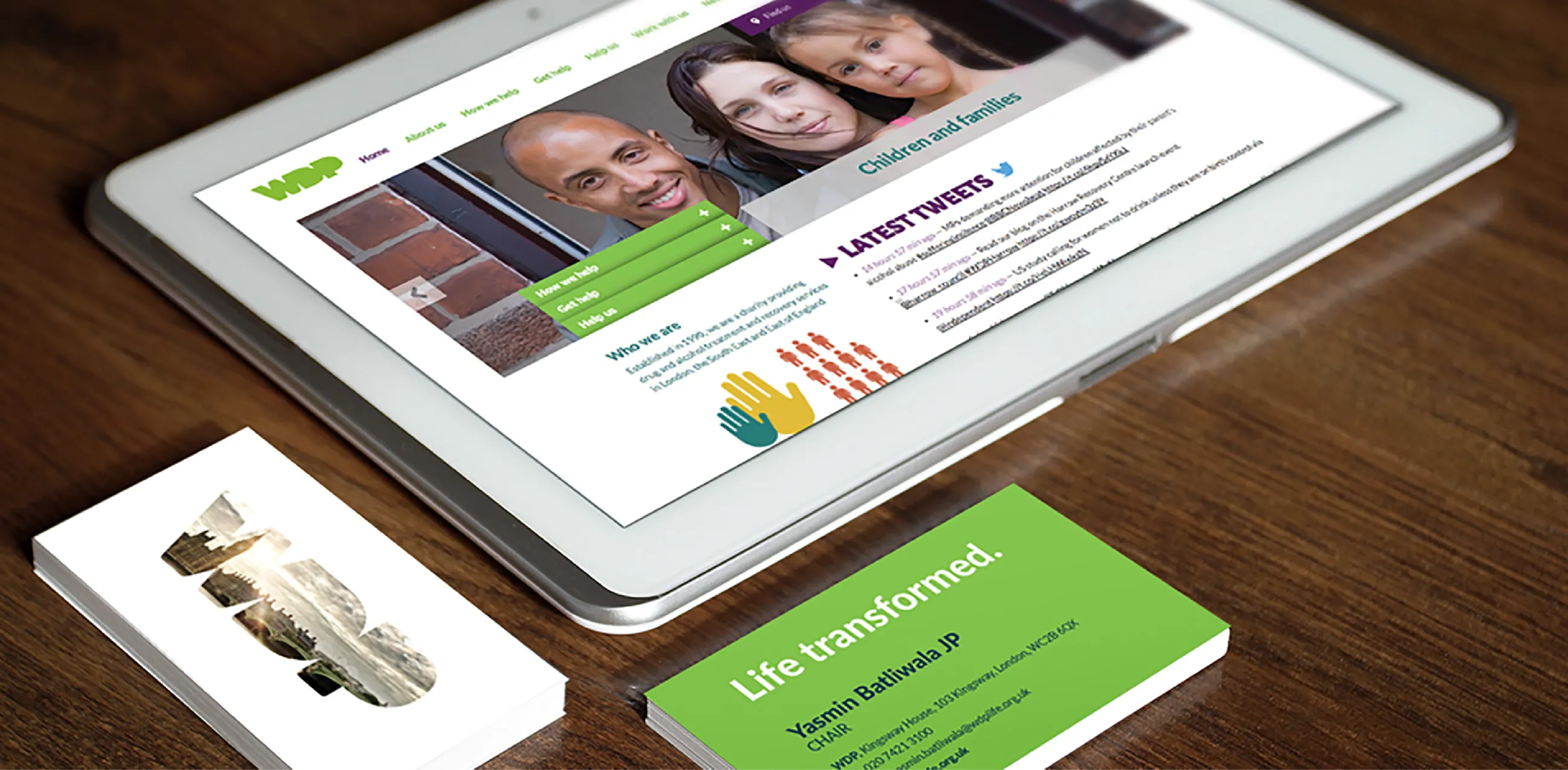
Visual identity, logo and photography
With a new brand name and compelling strapline agreed, WDP needed a visual identity that would make the charity more visible, coherent and consistent to users across the city.
It needed to be more appealing, memorable and distinctive, while bringing the charity’s people-centric, caring side to the fore.
Logo and colours
As part of our competitor analysis, IE had looked at the colours used across the dependency support sector.
This showed us that green was rarely used, with only two of the 34 organisations we’d looked at using green. That made it an easy decision to retain WDP’s existing fresh, vibrant colour – assisting recognition among existing stakeholders and providing standout among competitors – set off by deep purple accents and a selection of lively but natural supporting colours.
For the new WDP logo we chose simple typography. The logo’s simplicity allowed us to insert striking photography, providing a window to people’s stories and a connection to geographical locations.
Photographic style
Photography is another core element of the brand, and the style of imagery is an important factor in WDP’s brand guidelines.
We looked for photography that perfectly captured a ‘moment’ in time, in a natural reportage style, and selected images are desaturated. For infographics, the primary style is to emphasise the human stories behind the statistics, illustrated with photography.
Image
Support
Brand guidelines and website
All these elements were formalised in a set of brand guidelines to protect and police the new brand identity.
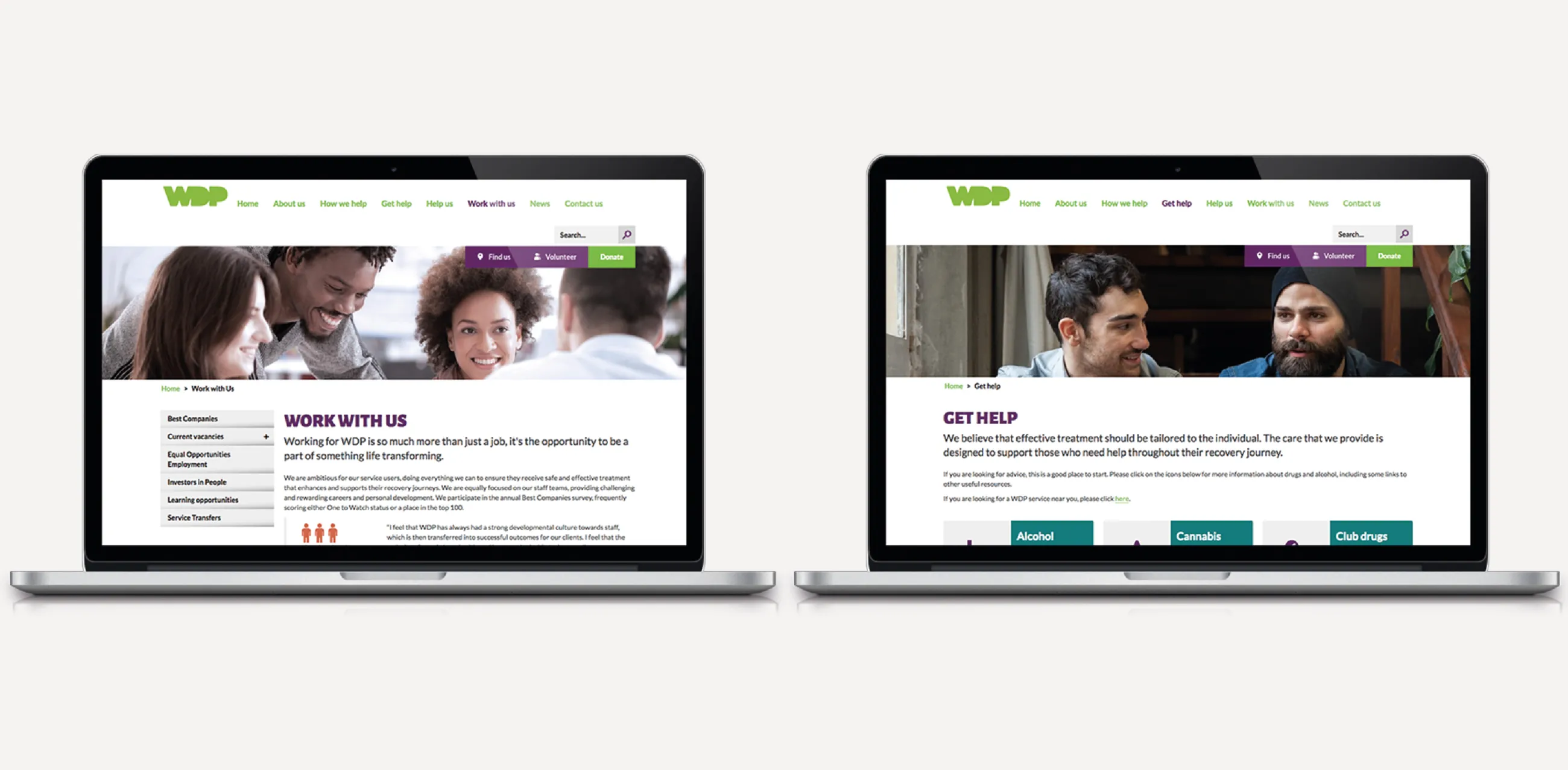
We supplied templates and assets to support the in house team in creating on-brand communications. IE Digital also designed and built a responsive new WDP website, to give the organisation a new public ‘shop window’.
It was essential that our new look continued to emphasise our core values and devotion to the sustained recovery of our service users. We are pleased to say this has been achieved. We have arrived at a fresh identity which reaffirms our collective commitment to the fundamental principles which guide our work.
WDP press release
Strategic advice leading to significant changes to organisational behaviours
34 competitors assessed and mapped to establish the charity's market positioning
Clear, gradual transition plan for sub-brands to adopt the core WDP brand