Keech Hospice
Keech Hospice Care came to IE Brand & Digital with a unique challenge: as a teaching hospice they deliver exceptional care, but public perceptions of the word ‘hospice’ often miss the mark — failing to capture the energy, compassion and celebration at the heart of Keech.
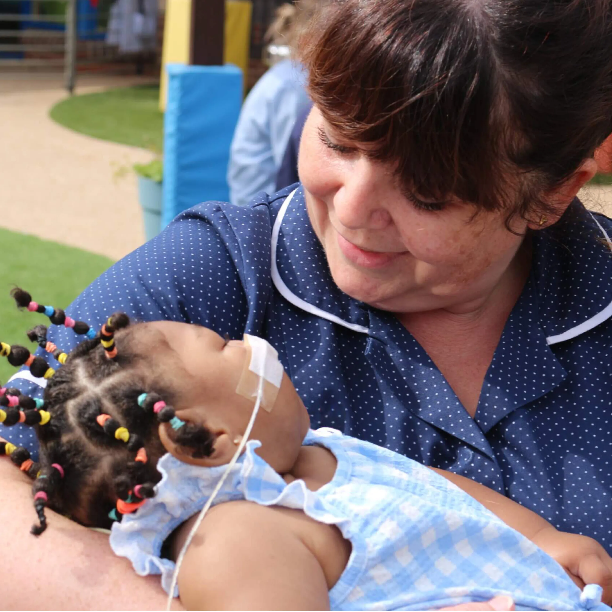
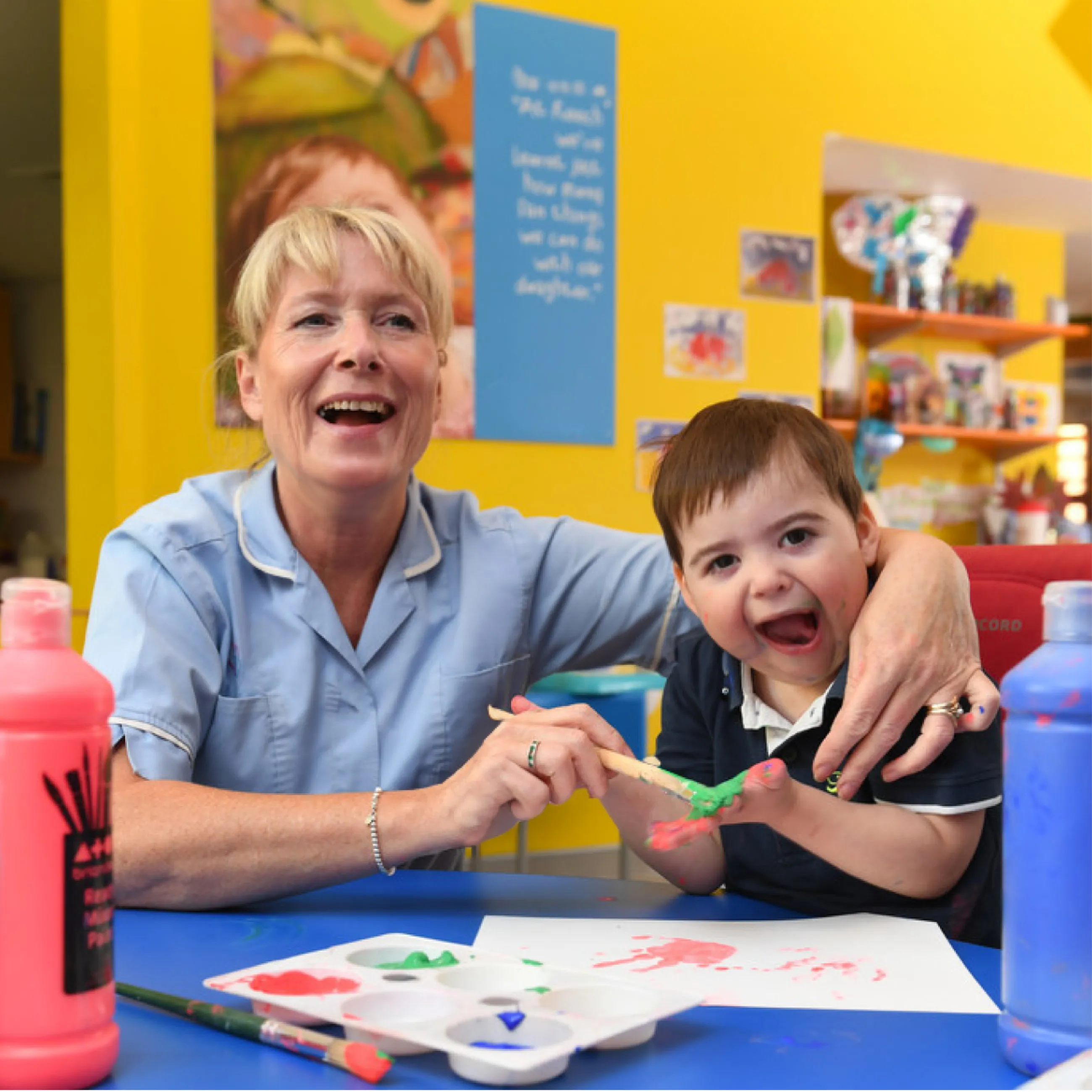
Keech supports adults and children across Bedfordshire, Hertfordshire, and Milton Keynes with life-limiting conditions — and their loved ones — delivering care at home, in hospice, or wherever they’re needed.
To reflect this fuller picture, and to help grow their visibility and impact, Keech commissioned IE Brand & Digital to lead a full brand repositioning exercise, followed by the design and build of a new website. The project was awarded following a competitive pitch process, and focused on brand first, with digital transformation to follow.
The work aims to bring greater consistency to Keech's brand – from care services and community outreach, to retail shops and online presence – ensuring every interaction reflects their mission to help individuals and families make the most of every day. Keech asked us to challenge assumptions, change perceptions and tell a more powerful story about who they are and what it means to help people and communities to live well and die well.
The project kicked off with an extensive listening phase to understand how Keech is perceived by its many audiences, and how it feels from the inside.
We conducted two in-depth stakeholder workshops with staff and volunteers, alongside fourteen 1-1 interviews with ambassadors, family members, referrers, and senior leadership.
The interviews revealed a clear pattern: those who had experienced Keech’s care first hand, spoke about it with deep affection and admiration. But beyond the immediate community, awareness and understanding was limited. Many people assumed Keech only cared for children, only offered support 'in-hospice', and their view of end-of-life care was often narrow and distorted.
IE’s research confirmed that Keech’s language and identity sometimes reinforced outdated ideas of hospice care: quiet, subdued, medical and sad. This disconnect between reality and external perceptions highlighted the need for a stronger, more accurate brand.
We also heard from colleagues that many people – especially in Hertfordshire and Milton Keynes – simply didn’t realise the full extent of what Keech offers. While some associated the charity with children’s care, or pictured a traditional hospice building, Keech’s services extend far beyond that: they care for adults too, offer in-home support, run community programmes, provide training for professionals, and operate a network of charity shops. This lack of understanding was limiting their fundraising reach and their impact.
There was a strong desire internally to unify Keech’s identity across all areas of the organisation — from adult and children’s services, to retail, education, and professional outreach — and to tell a clearer, more cohesive story.
Through this deep research phase, we uncovered a strong emotional core. Keech isn’t a place people go to die – it’s something far more joyful.
Patients, volunteers and staff described Keech as an upbeat and positive organisation, full of sunshine, joy, laughter, love and happiness.
Having listened to Keech's stakeholders, one surprising word described the brand we needed to build: Celebration.
At first glance, hospices won’t be thought of as celebratory, but we encouraged Keech to challenge preconceptions, educate audiences, and reframe people’s understanding. And to create a brand that celebrates: life, love, patients, staff, supporters and families.
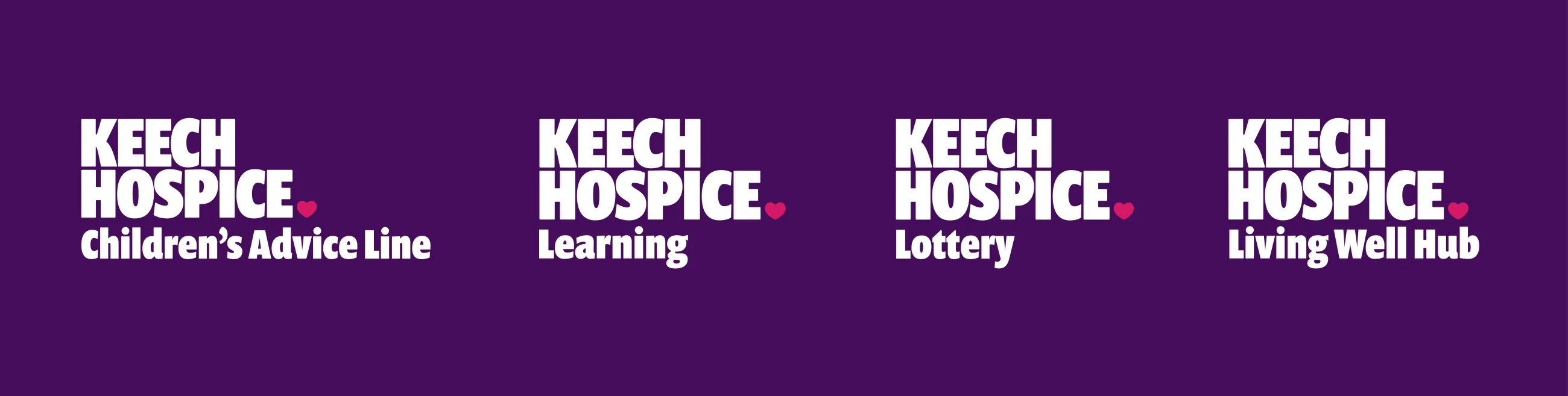
We helped Keech to simplify their brand architecture, and to make sure that Keech's 2023 merger with Bedford Daycare Hospice was better articulated.
We defined a tone of voice that’s positive, warm and inclusive, and made a number of key recommendations for Keech to implement including:
- Unpacking the word 'hospice' – to help people know what we mean when we use it
- Telling people what it's like to work in a hospice – yes it has its challenges, but it's never bleak
- Communicating Keech's breadth and ambition to be a national thought leader
- Helping more people find out about Keech's incredible work, and fixing patchy awareness
- Embracing a brand that's about life and death
- Addressing recruitment challenges
- Reaching diverse communities
- Creating an 'all age' hospice that serves adults and children
- Tweaking their name by losing the redundant word 'Care'
After the IE Brand team had listened to key community stakeholders to identify what makes Keech special, we began to create a brand that is energetic and empathetic, ambitious and authentic, influential and inspired, and passionate and proud.
With Keech’s new strategy and essence agreed, our team began to define how the brand should look and sound.
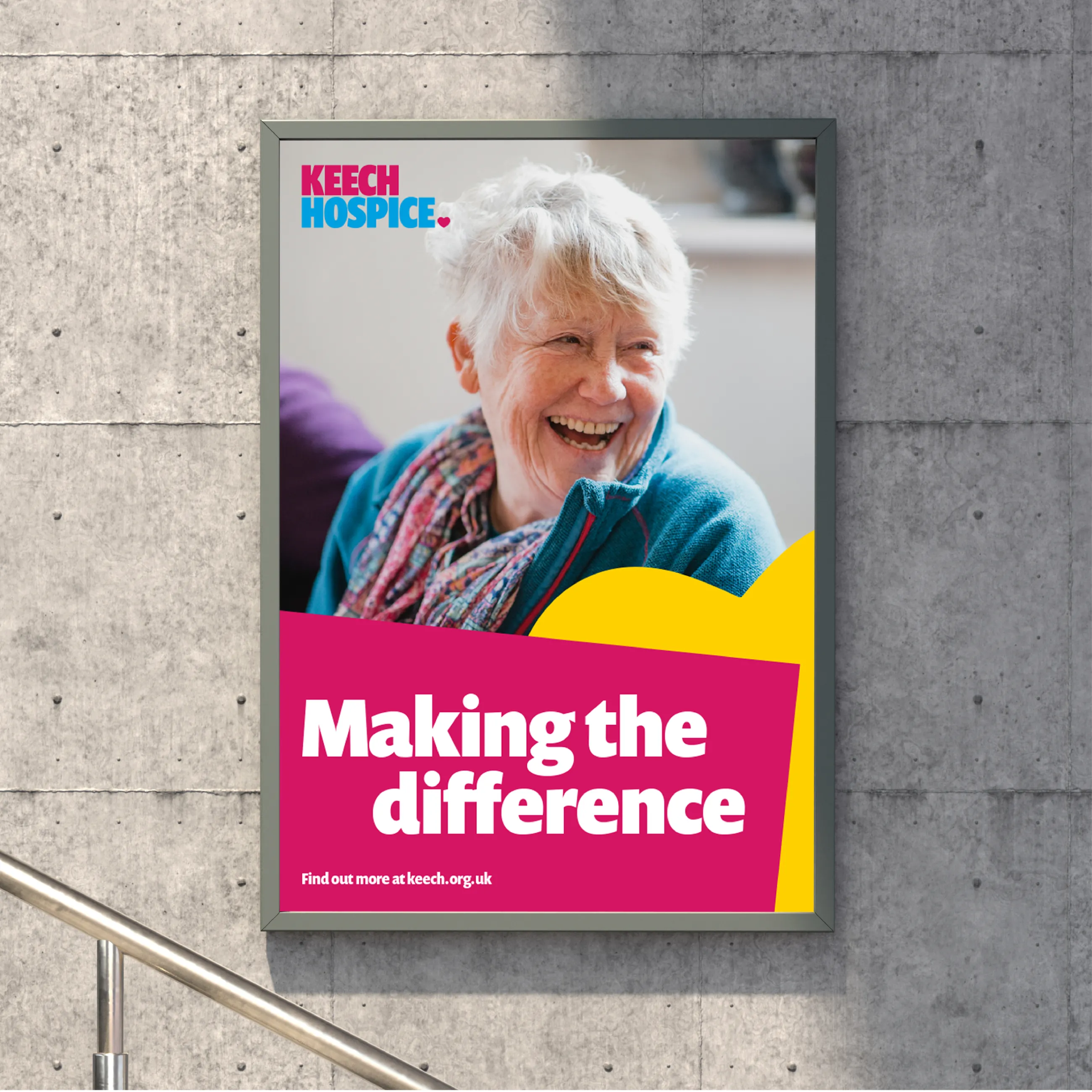
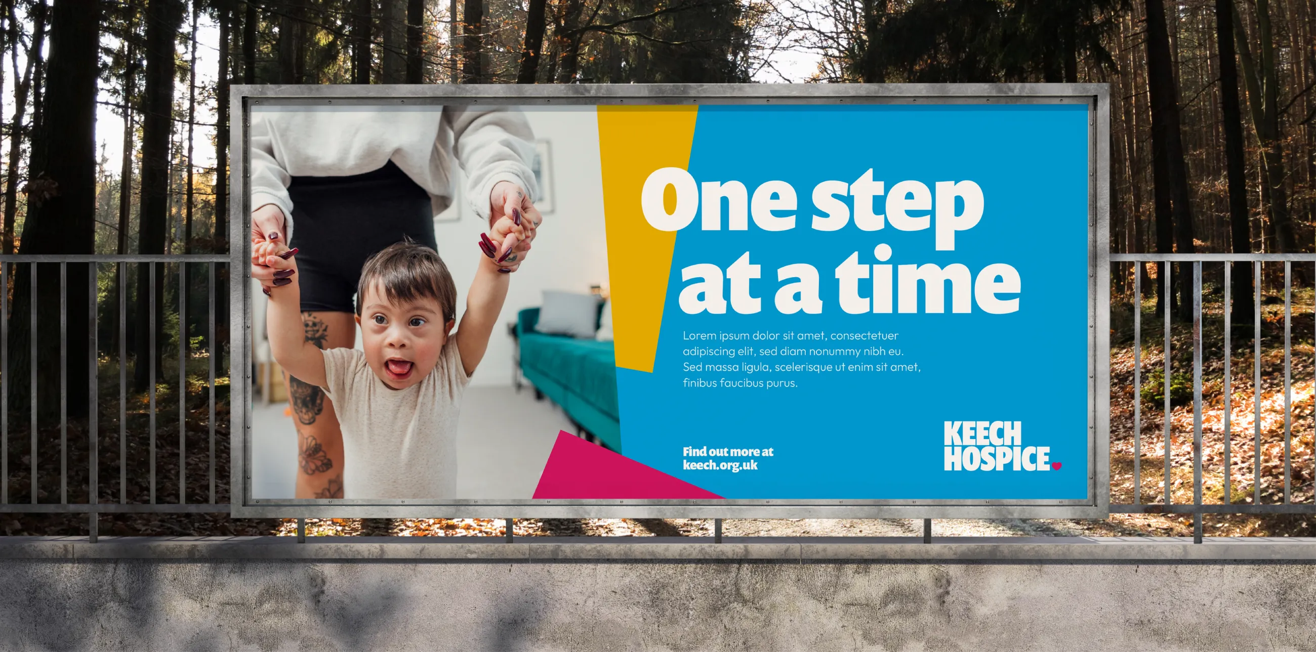
IE suggested a new strapline: Making the difference when it matters most, and developed a distinctive visual identity that shifts the tone of the charity from remembrance and reflection, towards the core brand idea of celebrating life. And we created a brand messaging matrix to serve as an easy-to-use 'cheat sheet' for marcomms professionals to easily articulate the charity's beliefs, calls to actions and campaign messages.
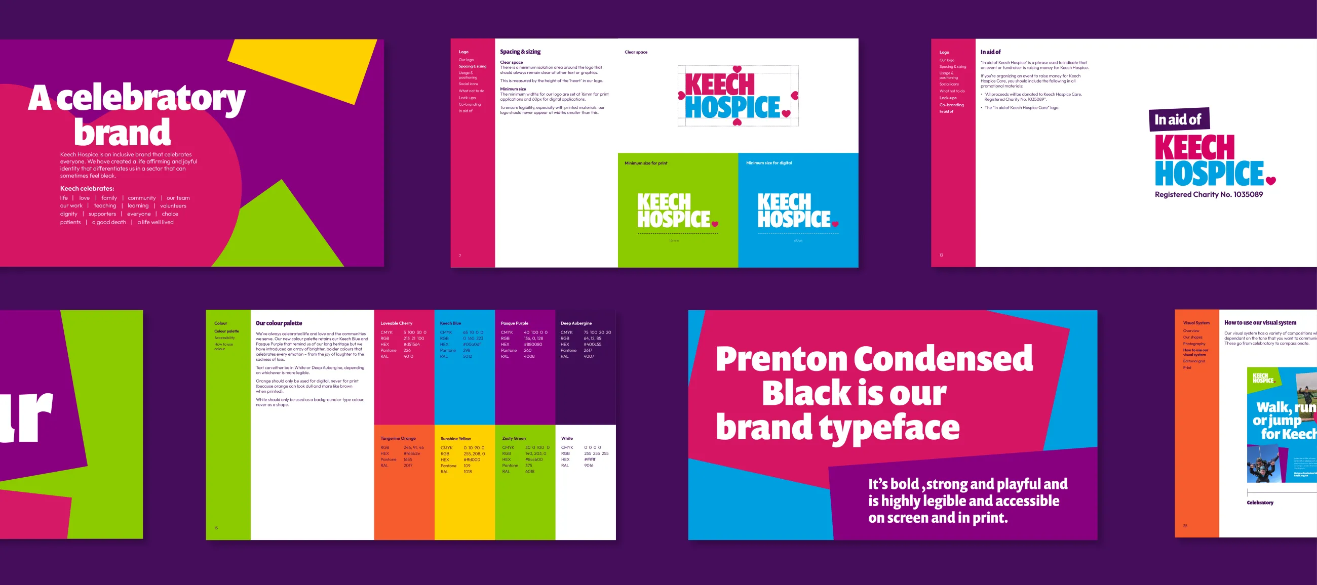
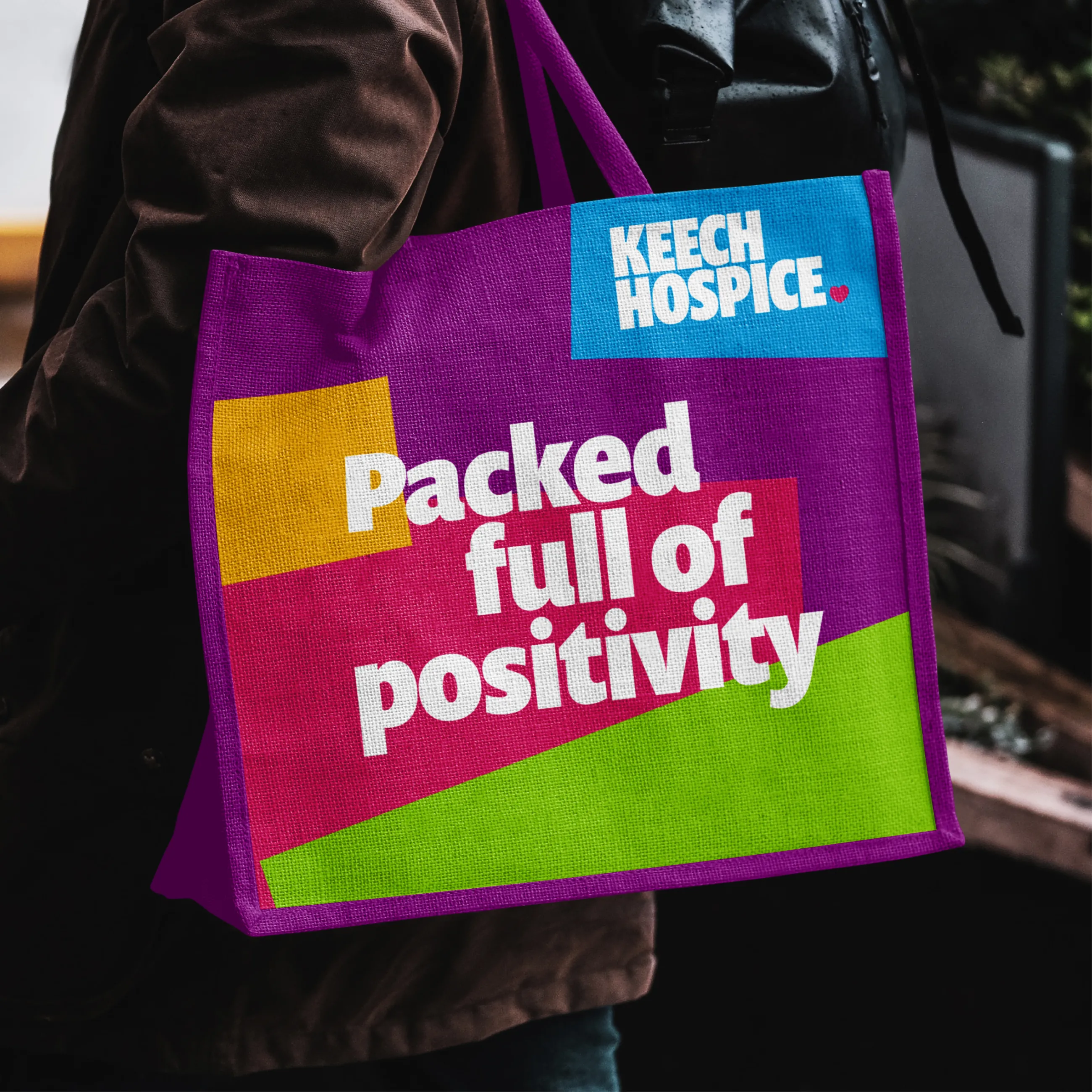
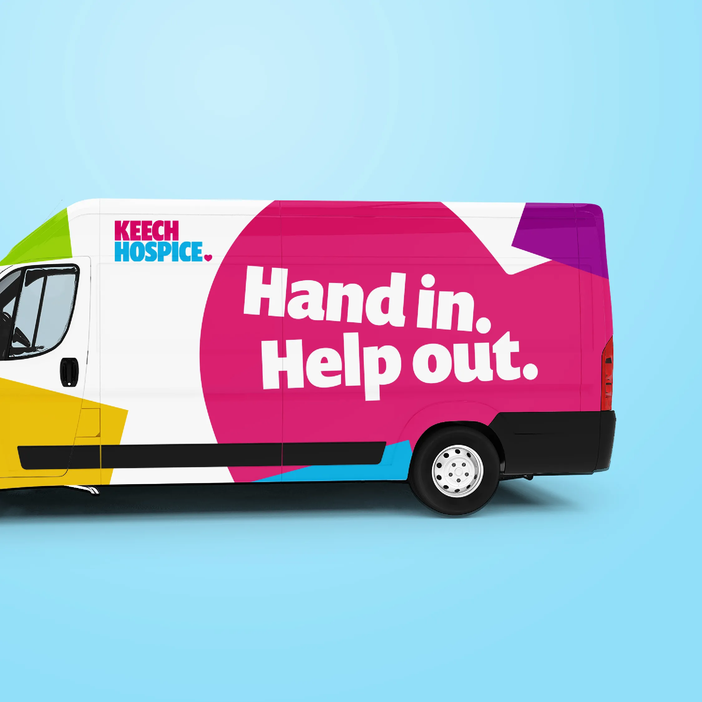
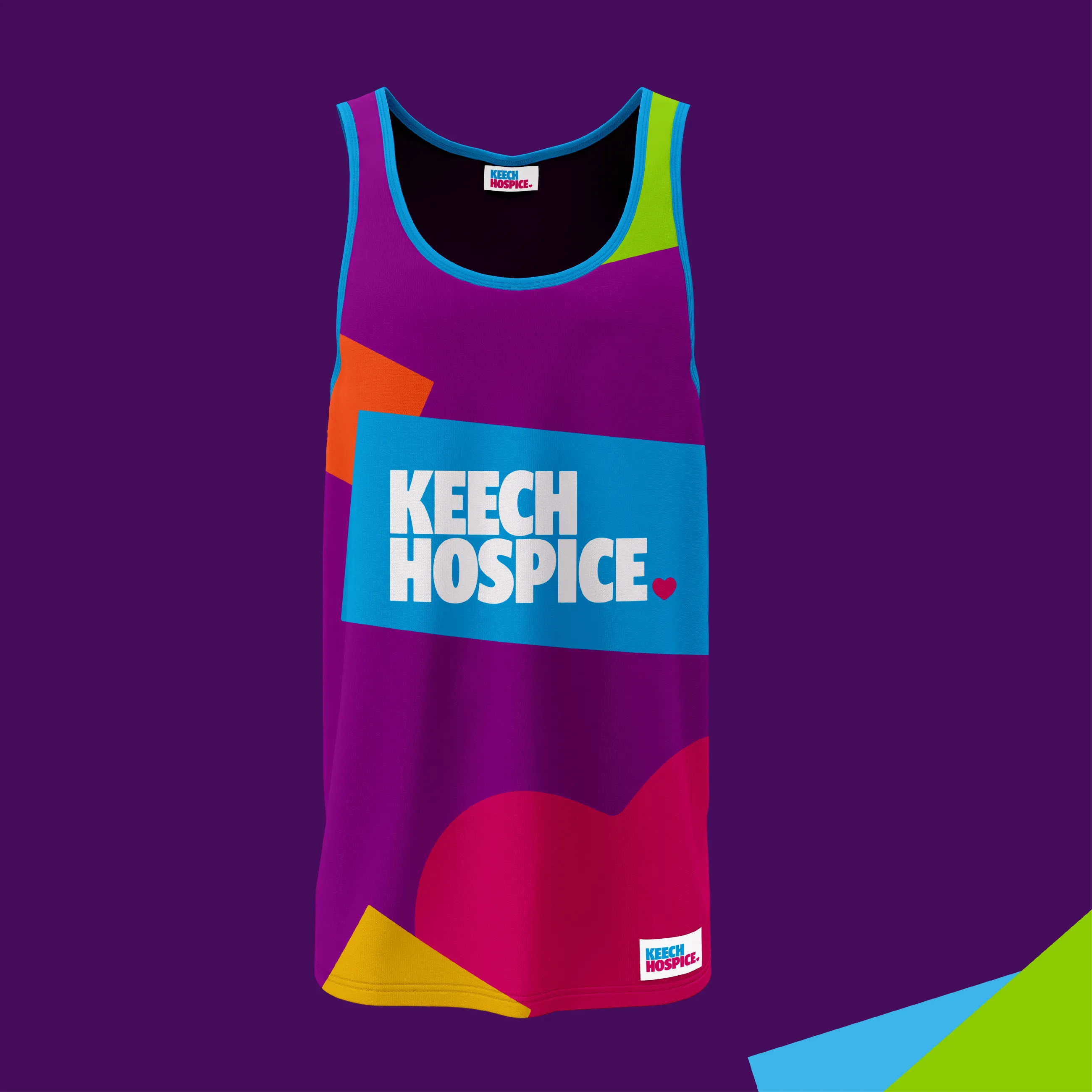
For Keech's new visual identity, we retained the familiar Keech heart motif, and the charity's key colours: Keech Blue and Pasque Purple, but introduced a vibrant, expanded palette: Zesty Green, Loveable Cherry, and Sunshine Yellow. The new colours help the brand communicate more clearly – reflecting the hope, care and strength at Keech’s core.
Our new visual system included:
- Graphic shapes inspired by human connection and togetherness
- Contemporary, clear typefaces suitable for clinical and retail use
- Accessible templates for reports, posters, merchandise and digital media.
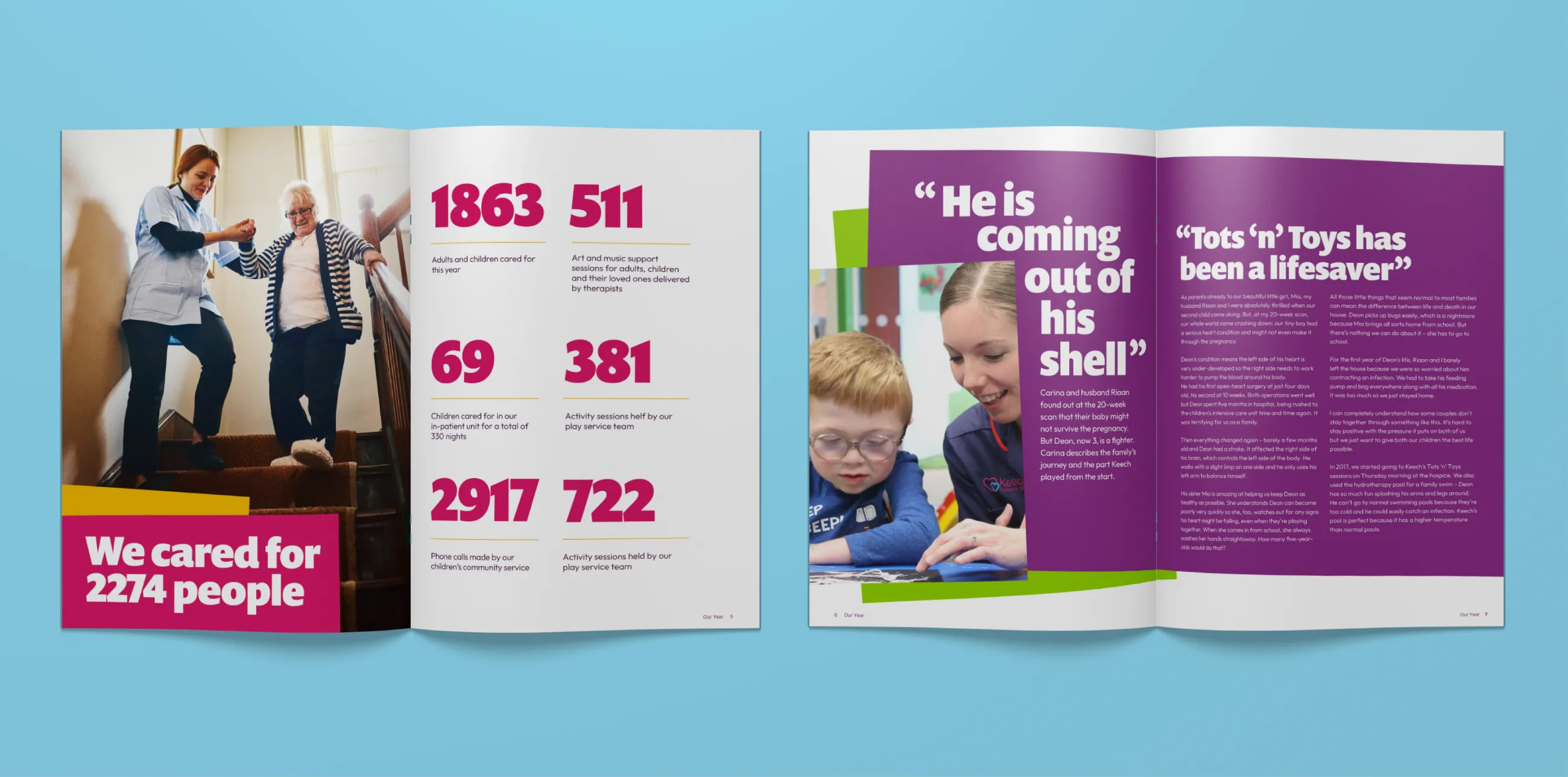
We delivered:
- An 84-page brand guidelines document
- A comprehensive messaging framework
- Iconography and infographics
- Templates for PowerPoint, fundraising, social media and more.
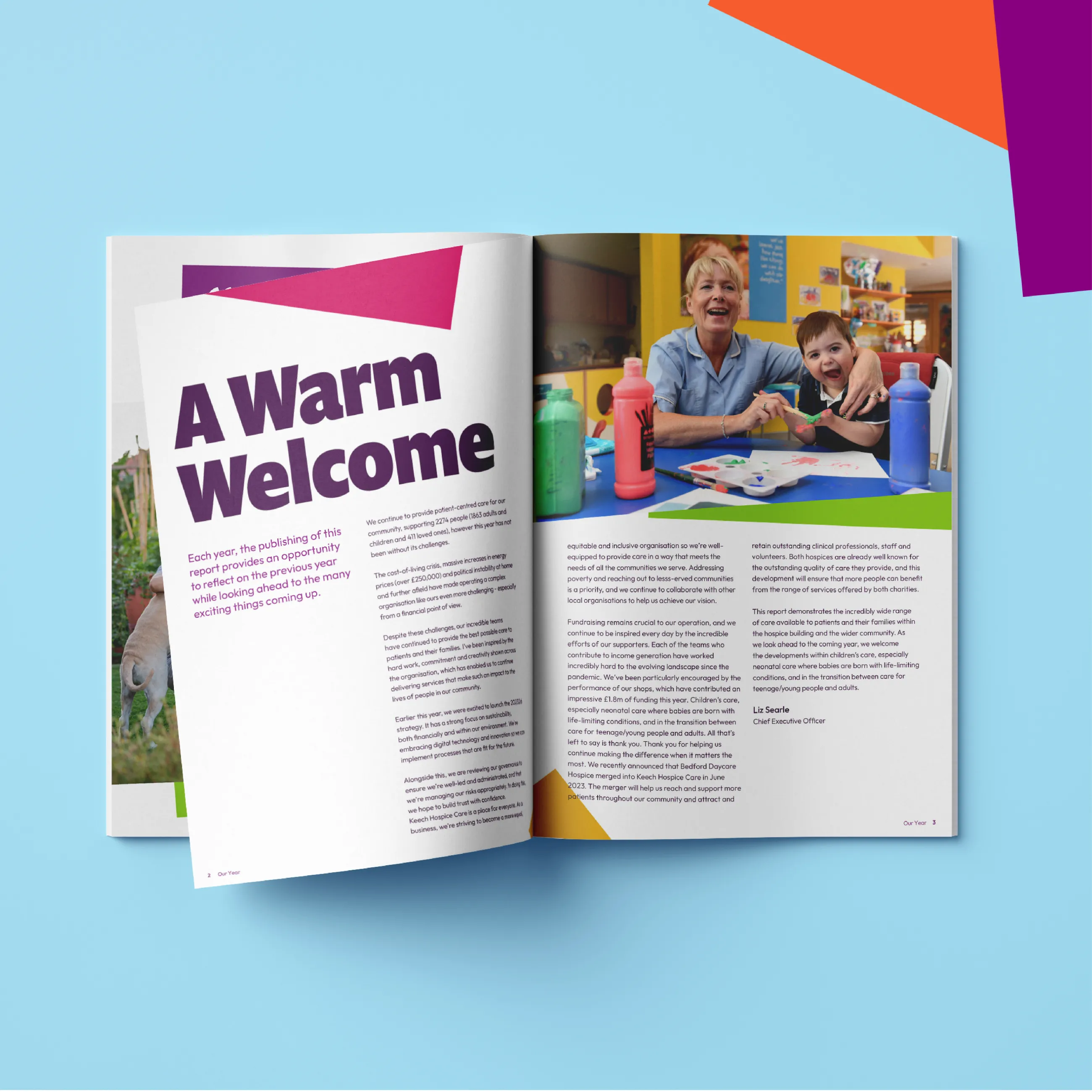
Keech’s CEO, Liz Searle explains: “...It’s important that our branding reflects the organisation we are today, who we’re here for and the breadth of services we provide. Our new visual identity is designed to best communicate that information to the diverse community we serve and highlight that we are accessible for everyone when they need us most. The re-fresh will also unify our services under a single, strong identity – both celebrating our heritage and preparing us for the future.”
The new identity has been adopted across Keech’s Wellbeing Centres and their 38 charity shops. It’s bold, joyful, and unmistakably Keech.
Brand transformation doesn’t end with templates and guidelines. Ollie Leggett, IE’s Founder and Brand Strategist, was privileged to be invited to address 240 staff and volunteers and to speak alongside families at the launch event.
IE supported Keech with internal training on tone of voice and templates, so the entire team could confidently communicate the refreshed identity.
Our partnership is continuing through:
- A new website project with IE Digital
- Guidance on inclusive outreach strategies
- Support for recruitment campaigns and public engagement.
The new Keech Hospice brand reflects the true heart of the organisation. It invites people in, makes them feel welcome, and reminds everyone that, even in the hardest times, life can still be celebrated.
Following a successful rebrand, IE Digital took Keech through a tried and tested consultancy-led website project, which began with an immersion exercise with stakeholder workshops and user research. We helped the charity to define visitors’ needs and user stories and dramatically reshaped their information architecture to make the website easier to use. We then created prototypes before moving onto visual design, development and QA.
By working with a single brand and digital agency like IE, Keech has saved significant time and money and ensured that their authentic new brand is faithfully translated into a beautiful and measurably impactful new website.
We’re proud to have played a small part in helping Keech to become ‘more than just a hospice’ – a national thought leader, an integral part of the local health and social care system, a sector leader and a change maker.